| Image |
Comment |
| 03/29/2008 12:27:42 PM |
Repetitionby ryandComment: Lighting and shading are good, focal point is well defined. Pattern is obvious. Well met challenge. For me, though, something is missing. There is just not the Wow. It's like the difference between an A and an A+. Slight, subtle, but makes all the difference in the world. |
 Photographer found comment helpful. Photographer found comment helpful. |
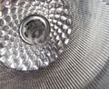
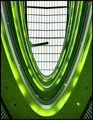
| 03/29/2008 12:24:17 PM |
At the Hopby banmornComment: Almost an optical illusion at this angle. In fact, I really had to concentrate on the balconies to bring them out into the foreground. So if that was your intent...bravo. |
| Photographer found comment helpful. |
| 03/29/2008 12:19:03 PM |
Zoom Zoomby kauisyndromeComment: Many patterns to see here. Did you play with lighting at all? I see the backlighting, what about front lighting pointed up into the shade? And the most shocking of all...putting in soft bulb and lighting it with itself? |
| Photographer found comment helpful. |
| 03/29/2008 12:14:47 PM |
|
| Photographer found comment helpful. |
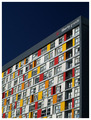
| 03/29/2008 12:13:39 PM |
Binary System by craigesterComment: Interesting architectural design. Perhaps cropping so that the building startes right at the right edge. |
| Photographer found comment helpful. |
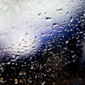
| 03/29/2008 11:54:09 AM |
r a i n d r o p sby PurpleFireComment: Imo, this stretches "pattern." There is a loose "sameness" which is part of the definition of a pattern, but I think it is almost to loose. |
| Photographer found comment helpful. |
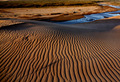
| 03/29/2008 11:52:48 AM |
dreamsby JulietNNComment: The pattern here is subtle. How many DNMCs did you get? Well, I see it. The colors are fabulous. The black of the "ground, walkway, what are you standing on?" is almost too much up near your lightsource. This is basic, though so you couldn't do too much about that. |
| Photographer found comment helpful. |
| 03/29/2008 11:50:45 AM |
Red and Whiteby kelvinyamComment: The colors are stunning! The angle seems harsh to me, but the red & blue are difinitely in the primary color range and those colors are pretty "brilliantly harsh" so maybe it does work...artistically. |
| Photographer found comment helpful. |
| 03/29/2008 11:48:23 AM |
Vby h2Comment: Generally pleasing to the eye. The green softens the "moderness" of this. My biggest question...What is that odd crane thing and why is it here? |
| Photographer found comment helpful. |
| 03/29/2008 11:46:53 AM |
Seatby booboo_goonComment: Rare time when texture and patterns work well together. |
| Photographer found comment helpful. |
Home -
Challenges -
Community -
League -
Photos -
Cameras -
Lenses -
Learn -
Help -
Terms of Use -
Privacy -
Top ^
DPChallenge, and website content and design, Copyright © 2001-2025 Challenging Technologies, LLC.
All digital photo copyrights belong to the photographers and may not be used without permission.
Current Server Time: 08/27/2025 10:12:50 AM EDT.