| Image |
Comment |
| 08/24/2003 09:04:35 PM |
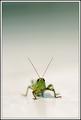
Hopperby JackoComment: How'd you get him to cooperate so well? This is a nice image, though it's a pity that most of the 'hopper is out of focus - it's visually distracting and hard to say whether that's a positive or a negative space. |
 Photographer found comment helpful. Photographer found comment helpful. |
| 08/24/2003 08:50:39 PM |
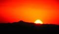
Red Sunriseby cimarron98Comment: Very pretty colors, but maybe a bit over-exposed - the sun has burned in interesting colors, and the edges of things are blurry, as if there might have been some camera shake? |
| Photographer found comment helpful. |
| 08/24/2003 08:46:44 PM |
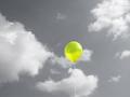
Aloneby rickhd13Comment: Selective desaturation? Used to very good effect - the balloon is doubly striking for being the only bit of color present. |
| Photographer found comment helpful. |
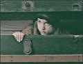
| 08/24/2003 08:42:55 PM |
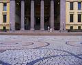
Come on dear, we're lateby johnmkComment: I really like what you've done with this - the way the space takes over, dwarfs your subjects, leaving them isolated and a bit lonely. This is a very strong image and there's no way it would work half as well without all of the space and distance. |
| Photographer found comment helpful. |
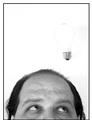
| 08/24/2003 02:04:21 PM |
Not a Bright Ideaby moodvilleComment: I like the idea here, but it's so bright the shape of the bulb is almost lost. Is that an accident, or was there a bit of string or the like that had to be washed out also? It's very distracting and I think the picture would be much stronger if the bulb were slightly more defined. |
| Photographer found comment helpful. |
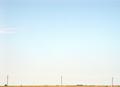
| 08/24/2003 02:03:20 PM |
Telephone Poles and Tractorby ArtifactsComment: I don't think the negative space really enhances this picture - the picture seems almost not to exist at all. I'd have liked to see the lower left corner a bit larger, still with plenty of negative space. |
| Photographer found comment helpful. |
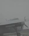
| 08/24/2003 02:02:31 PM |
Groundedby spillerComment: This is an interesting shot, but the plane is so misted it almost looks like part of the background - greyed out and fading - I'd have liked more contrast, but I'm not sure how that could have been achieved, given what the weather looks like. |
| Photographer found comment helpful. |
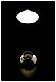
| 08/24/2003 10:48:49 AM |
Coffee and lightby e301Comment: I like the idea here, but I like the photo better when I scroll so that I can only see the coffee, not the light. The light doesn't seem to add much - and the difference in brightness between it and the cup and saucer is pretty marked. |
| Photographer found comment helpful. |
| 08/17/2003 09:10:12 PM |
the stowawayby grigrigirlComment: This is a lovely picture. It looks like it ought to be a capture of some scene in a movie.... I'm not sure I can articulate why I think it works so well, in this case, only that it does. |
| Photographer found comment helpful. |
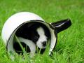
| 08/16/2003 08:03:37 PM |
Inside Looking Out by connieComment: This is so frighteningly adorable that I don't have words for it. I hope that container is as large, and the animal as comfortable, as it looks. Such a darling little peeping face. I also like that there's not much glare here, and yet the shadowed areas can still be made out fairly clearly, where they're in focus. |
| Photographer found comment helpful. |
Home -
Challenges -
Community -
League -
Photos -
Cameras -
Lenses -
Learn -
Help -
Terms of Use -
Privacy -
Top ^
DPChallenge, and website content and design, Copyright © 2001-2025 Challenging Technologies, LLC.
All digital photo copyrights belong to the photographers and may not be used without permission.
Current Server Time: 08/22/2025 08:33:46 AM EDT.