| Image |
Comment |
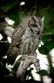
| 06/15/2003 02:21:19 PM |
Ranger Rickby vtruanComment: This is a lovely shot, especially the focus - I like that the background doesn't intrude, yet you can see details of the branch and feathers that are just incredible. Very appropriate to the magazine, thematically and in tone, as well. |
 Photographer found comment helpful. Photographer found comment helpful. |
| 06/15/2003 01:18:12 PM |
|
| Photographer found comment helpful. |
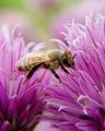
| 06/14/2003 01:13:37 PM |
DISCOVER "Killer Bees"by severinComment: Very pretty - though it looks a bit like the bee is hanging in midair with its wings unspread (and therefore not flying), at this detail level. |
| Photographer found comment helpful. |
| 06/14/2003 01:11:40 PM |
Canadian Gardeningby mcraelComment: This is a nice macro shot - the detail of the flower's center, to the point of seeing the grit, and the flush of (wax? oil? liquid?) on the petals, is really nice. It's easy to see how text could be placed over the petals without damaging the image as well, when it was placed on the cover. |
| Photographer found comment helpful. |
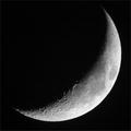
| 06/14/2003 01:10:29 PM |
Sky & Telescopeby Chilly0999Comment: Nice, nice dramatic photograph. I like the way most of the photo is black, and yet there's this awareness of weight to the upper left corner, the awareness that the moon is there, just hidden. The detail on this, and the framing of it, are both excellent. |
| Photographer found comment helpful. |
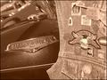
| 06/14/2003 01:07:44 PM |
American Iron Magazineby justineComment: This is a nice shot, overall, but I have trouble envisioning where magazine text would go other than in a neutral frame, if one were placed around it. The contrast between the smooth/sleek bike and the patterns and crowded feel of the patches to the right is really nice and works well, though. |
| Photographer found comment helpful. |
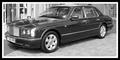
| 06/14/2003 12:55:00 PM |
Top Gearby trishComment: A nice black and white - the building in the background is distracting, especially at the left side, but I don\'t see how you could have blurred it out without also losing the crispness on the car itself, which would have been a poor trade-off. This might be hard to fit on a cover, unless they frame it above and below with dead space or use it as a smaller accent picture. |
| Photographer found comment helpful. |
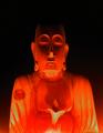
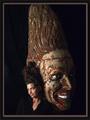
| 06/14/2003 12:52:38 PM |
conehead digestby grigrigirlComment: Does that magazine exist? Very interesting visual effect, though; it seems a pity the top of the statue (?) is cut off. |
| Photographer found comment helpful. |
| 06/14/2003 12:40:29 PM |
Garden Designby DennisFComment: Nicely dramatic - good, vivid colors, and the use of the black background brings it out nicely. I like that it's off-center and cut off to the left, and I have no idea exactly why that works so well, but it does. |
| Photographer found comment helpful. |
| 06/14/2003 12:39:25 PM |
PC Worldby SappyComment: A nice choice of magazine and subject for this challenge, and very dramatic/pretty. I don't get inside my computer often and must ask what on earth that is, however.... |
| Photographer found comment helpful. |
Home -
Challenges -
Community -
League -
Photos -
Cameras -
Lenses -
Learn -
Help -
Terms of Use -
Privacy -
Top ^
DPChallenge, and website content and design, Copyright © 2001-2025 Challenging Technologies, LLC.
All digital photo copyrights belong to the photographers and may not be used without permission.
Current Server Time: 08/24/2025 04:31:54 PM EDT.