| Image |
Comment |
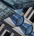
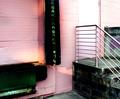
| 07/22/2005 01:00:48 AM |
IMG_1124mariott-detail2W.jpgby sfaliceComment: Originally posted by dragonlady:
Now, this is making me dizzy! |
Have to agree. The original orientation would look much better, I think. Really like the design color contrasts of this and the angle. Really is a very good abstract. Not sure how to improve this other than a 90 degree rotation left. I like the shapes and colors of the blue/beige bulding enough that I do not mind them seeming to over power the other building. You might want to think about bringing out the reflections in the building on the upper left which I am fairly certain you could do by selecting that area and boosting the levels/curves and and contrasts a bit. Nice work. |
 Photographer found comment helpful. Photographer found comment helpful. |
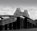
| 07/19/2005 01:06:27 AM |
jb.jpgby dragonladyComment: Marion you did a great job in post on this as the work you did on the sky gives the image a bit a drama that really adds to it. The billowy clouds you shopped in really make a nice layer upper level to the image and are a great contrast to the choppy river. The bridge image itself is very finely shot and I like the contrasts and use of BW very much. Is this a new bridge and old bridge together, one goes one way the other the other way? I really the contrasts of the newer bridge to the old and was wondering if you could find another angle to bring that out a bit. There is plenty of the old bridge in this (great detail on that, BTW) and if you shot left a bit you might get more of the newer bridge in the image for a better contrast of the two. Neat stuff! |
| Photographer found comment helpful. |
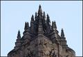
| 07/19/2005 12:56:44 AM |
William Wallace Monumentby riotComment: I think I might agree about increasing the contrast a bit. This is a great bit of stunning architecture and anything that you can do in shooting or post to bring out this wonderful detail should be done. I'm not sure that the centering in this works in a horziontal/landscape orientation and that it might be better in portrait/vertical. Well perhaps not. But the level is off a bit and it is not true center. Not sure if you want to fix that or not or reshoot. I assume that you used a tripod as your specs indicate the lense was closed down a bit to f/ 11 and you used a 0.8 sec. shutter speed. Guess you were quite a distance from this. I have no idea where you might get to shoot this at a better angle. I would like to see the detail more pronounced and more of the lower portion of the building which seems interesting as well. I do like the symmetry in this and the fact that you did not blow out the sky. Great architecture and I hope we see some more from you and Scotland. Thx! Message edited by author 2005-07-19 00:57:42. |
| Photographer found comment helpful. |
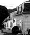
| 07/19/2005 12:14:31 AM |
mill-houses.jpgby dragonladyComment: I am usually in the same camp with singe about the wires. But I grew up in a small town like this and they are just unavoidable...I tried shooting the family church there and you just cannot get around them. They somewhat work for me in this because of the angle you chose. I would like to see them repeated down the street but some of them get lost in the far dark background. Maybe some PS dodging or brigtening of that area would bring them out more, rather than less, because they are there and it helps to make the shot. Note further that I regularly remove window air conditioners from images that I have done, but again, their repitition down the street also adds to the flavor of this image for me. Great stuff....ah home....better call Mom tomorrow and say hi! |
| Photographer found comment helpful. |
| 07/18/2005 02:42:26 PM |
Steps Of Solitudeby singeComment: Not sure about the blowout, but the lighting is interesting otherwise. If the steps are the subject perhaps more of them should be showing. There are very interesting lines and angles, especially the railing, which might become more pronounced with a different angle and more emphasis on the steps. |
| Photographer found comment helpful. |
| 07/18/2005 12:20:09 AM |
|
| Photographer found comment helpful. |
| 07/12/2005 07:03:00 AM |
Glasshouse Plazaby FirstyComment: Heck this didn't do that bad. You sure as heck beat mine. Great blues in this. I like the perspective of the lines widening from top to bottom and the great rich blues in it as well. I also like the repitition of the the silver squares in the dark lines. The angle is good. How much more of there is the cylindrical area to the left? I there is more, I'm wondering how this would look with that on upper right angle totally and the flat area on the lower left angle with out the vertical area that is now on the upper left? Great stuff any which way you look at it. |
| Photographer found comment helpful. |
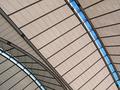
| 07/12/2005 06:55:34 AM |
roof-640.jpgby FirstyComment: I think I agree with Anders' assessment that this would have done well in the challenge. The exposure is really fine. I do not know the edifice that you shot, but I might have gone with including more of the curve in the lower left corner. The lines of the straight part are very good and strong and I think with less of them and more of the curve area you would have had some stronger shape contrasts. Really loving the great lines of blue breaking up the earthtones in this. Oh the curve area has some distorted linear reflections in it that would be more evident with more of the curve, I think. Cool! |
| Photographer found comment helpful. |
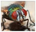
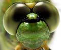
| 07/11/2005 08:44:21 PM |
Hello by gaurawaComment: Superb detail on this fly, Guarawa! Many congrats on your ribbon! |
| Photographer found comment helpful. |
| 07/11/2005 08:41:39 PM |
|
| Photographer found comment helpful. |
Home -
Challenges -
Community -
League -
Photos -
Cameras -
Lenses -
Learn -
Help -
Terms of Use -
Privacy -
Top ^
DPChallenge, and website content and design, Copyright © 2001-2025 Challenging Technologies, LLC.
All digital photo copyrights belong to the photographers and may not be used without permission.
Current Server Time: 08/17/2025 01:19:57 PM EDT.