| Image |
Comment |
| 05/20/2006 09:20:04 PM |
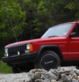
Anyone Care for a Glass of Nikon Cabernet ???by elinkugeComment: I like this idea a *lot*, but I think you could have improved the execution. the shadows are harsh and focus is soft. a more interesting background and lighting could have made this shot a real contender. |
 Photographer found comment helpful. Photographer found comment helpful. |
| 05/20/2006 09:14:20 PM |
One of Many Uses . . .by karmatComment: clever. deeper depth of field would have improved this. the guy lines in the background are a little distracting too, but this is a good idea! |
| Photographer found comment helpful. |
| 05/20/2006 09:06:37 PM |
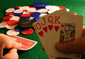
High Stakesby GT350Comment: good idea. the light is a litte dark on the hand of cards. I realize the subject is the lenscap, but the eye is still drawn to the foreground. |
| Photographer found comment helpful. |
| 05/19/2006 12:13:24 AM |
Fall From the Sky by steinarComment: awesome lighting and pose. I'll be looking firward to seeing how you created this excellent shot. |
| Photographer found comment helpful. |
| 05/19/2006 12:11:40 AM |
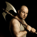
Barbarian by kiwinessComment: so you killed all your brothers and now you are hunting down the rest of the competition to insure another ribbon, eh Gary? Your lighting here is excellent, especially on the blade of the axe, where it would have been easy to overexpose the edge. great expression, great catchlights. oh well, maybe red or yellow will be left for me... :) |
| Photographer found comment helpful. |
| 05/14/2006 09:37:59 PM |
|
| Photographer found comment helpful. |
| 04/20/2006 12:52:41 AM |
Printempsby JutildaComment: pretty girl, cool pose. tonal range seems a bit blah - the dark tones need to be punched up a little |
| Photographer found comment helpful. |
| 04/11/2006 12:37:40 AM |
Tortoiseby GatorguyComment: I like the angle of the image. wisth the depth of field was deeper though so that the front flipper was in focus |
| Photographer found comment helpful. |
| 04/02/2006 08:28:05 PM |
|
| Photographer found comment helpful. |
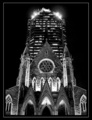
| 04/02/2006 08:18:05 PM |
Up to the Skyby mariomelComment: great lighting and good tones. the building looks like it is leaning to the right though. needs slight rotation? |
| Photographer found comment helpful. |
Home -
Challenges -
Community -
League -
Photos -
Cameras -
Lenses -
Learn -
Help -
Terms of Use -
Privacy -
Top ^
DPChallenge, and website content and design, Copyright © 2001-2025 Challenging Technologies, LLC.
All digital photo copyrights belong to the photographers and may not be used without permission.
Current Server Time: 08/05/2025 03:33:43 PM EDT.