| Image |
Comment |
| 11/10/2010 08:26:08 AM |
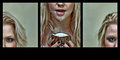
Let's do thisby hernan43Comment: This made me laugh :) Nice choice of colors. The pink and blue were a good balance against the black ninja suit, and provide a creative variation to the usually dark-colored theme. |
 Photographer found comment helpful. Photographer found comment helpful. |
| 11/10/2010 08:22:40 AM |
Detachedby LutchenkoComment: I like the overall sharpness of the image. The lighting was exceptionally good, too. I hope to see your notes on the lighting setup. |
| Photographer found comment helpful. |
| 11/10/2010 08:00:30 AM |
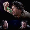
A Fantastic Surprise !by StrikeslipComment: hey, the third photo did not show the TEEF. :)
Good lighting. I hope to see the details of the lighting setup on your notes after the challenge. |
| Photographer found comment helpful. |
| 11/10/2010 07:56:35 AM |
Predictable outcome :) by sarampoComment: Nice control of outdoor light. I particularly like the balanced dominance of blue and orange on the rather perfectly exposed third photo. In my opinion, it would have scored well on the complimentary color challenge. The creative idea of this entry is nice, although the first two photos look like a nicely done snapshot. The location could also have been better. Overall, a good take on the challenge. |
| Photographer found comment helpful. |
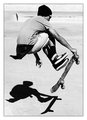
| 11/02/2010 12:17:04 PM |
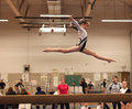
Little Lucy Leaps Longby SiouxComment: sharp focus on the subject. good timing on the shutter. but i would prefer a more blurred background. also, i tried this photo with the bottom portion cropped off, it did not give a sense of height, but it was better. so a tighter crop may have worked better for this image. still, nice capture. |
| Photographer found comment helpful. |
| 10/29/2010 05:43:56 AM |
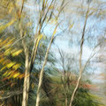
fallshineby posthumousComment: I like the blur. I like blurry photos but only when the blur was used to achieve an effect, and in this case, you succeeded in doing that. Some photos are blurred because the photographer lacks the skills. Some are blurred because it was how the "artist" intended them to be, because they want their audience to keep guessing, and they make me laugh, or maybe i'm just not a fan of those type of artistic photos. This, however, is blurred because that was the effect that you were trying to achieve, and it adds beauty to a composition that was already good to begin with. Nicely done. 8 9 |
| Photographer found comment helpful. |
| 10/29/2010 01:30:15 AM |
Fear of the Dark by gyabanComment: You lacked time to do this, and still take the blue ribbon. Dude, you're one amazingly extraordinarily talented genius. And that's an understatement. |
| Photographer found comment helpful. |
| 10/28/2010 12:40:57 PM |
Mid-day shadowsby FocusPointComment: Embracing the harsh daylight. Instead of dwelling on the negative effects of midday sunlight, why not explore the positive things that it brings. It produces strong, dramatic shadows. Photographed correctly, shadows tell a lot of story in a photo. This shot is perpect example of how you were able to beat the challenge of midday sunlight. Well done. |
| Photographer found comment helpful. |
| 10/28/2010 12:16:05 PM |
Keeping symmetry in perspectiveby essayComment: I would describe this photo as a very nicely executed snapshot. And i think it's perfect for the challenge.
What i like about this photo so much is that it shows the realism of the situation. I mean if i were a professional photographer, why would i shoot during midday outdoor? I'd rather wait for a better sunlight. But the reality is, most camera owners aren't professional photographers who shoot artistic architectural photography. Some are tourists taking snapshots of places they went to. Some are just regular people who happen to be in a nice photo-worthy location during midday, and they happen to have brought along their camera. These people are the ones faced with the challenge of taking good snapshots during harsh midday sunlight. These people taking snapshots during midday should learn a thing or two from this photo. |
| Photographer found comment helpful. |
| 10/28/2010 12:01:06 PM |
Harshby MaryOComment: Very harsh midday lighting indeed on the wall. But i think the challenge suggest that we not only show midday light, but how we overcame it as well. Compensating exposure for the very bright wall is one way to show that you were trying to beat the harsh midday sunlight, but that wasn't done here.
The lower left side of the margin was off by a few pixels. |
| Photographer found comment helpful. |
Home -
Challenges -
Community -
League -
Photos -
Cameras -
Lenses -
Learn -
Help -
Terms of Use -
Privacy -
Top ^
DPChallenge, and website content and design, Copyright © 2001-2025 Challenging Technologies, LLC.
All digital photo copyrights belong to the photographers and may not be used without permission.
Current Server Time: 08/18/2025 03:38:17 PM EDT.