| Image |
Comment |
| 05/22/2003 07:43:02 PM |
Pastel complimentsby ploogieaComment: Huh. Most of the non-intense coloured photographs so far have left me feeling like they missed the topic, but this one works somewhat better for some reason. The pink stands out very well against the pale yellow-to-green, which suggests you've hit the proper colour contrast. Very well done. |
 Photographer found comment helpful. Photographer found comment helpful. |
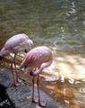
| 05/22/2003 07:40:09 PM |
Mowby rickhd13Comment: Excellent! Red, green, and the nice neutrality of black, no distractions, and a natural-looking snapshot. |
| Photographer found comment helpful. |
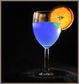
| 05/22/2003 07:39:30 PM |
A Good Mixby RuchartComment: Blue Curacao, by any chance?
Very nice, and something I haven't seen yet this round. I like choice of light direction as well; it nicely higlights the colours without introducing any real distraction. |
| Photographer found comment helpful. |
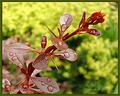
| 05/22/2003 07:33:16 PM |
Rain dropsby pitsamanComment: Probably more to lighting than anything, the green colour in the background is more yellow than makes the best complementary colour setup for this. A more vivid background would have suited that better. Also, the blur in this case is rather distracting, even though I understand the desire to focus finely on the droplets. |
| Photographer found comment helpful. |
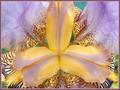
| 05/22/2003 07:31:54 PM |
Fanfareby kavamamaComment: I'm afraid this one didn't grab me topically as much as some of the other flower pictures -- the colours are in fact complementary but the lack of vividness in them doesn't make it quite as obvious. Also, for some reason, the flower itself looks actually rather scary. |
| Photographer found comment helpful. |
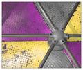
| 05/22/2003 07:26:48 PM |
Color Wheelby greenem2Comment: Neat. Color/complementary colour/neutral, repeat. Very topical. Kinda strange to look at, though -- I'm wondering where it's from. |
| Photographer found comment helpful. |
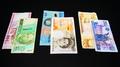
| 05/22/2003 04:22:32 PM |
three pairsby tomzinhoComment: Hmm. On the one hand, yes, you do have some complementary colours there. On the other hand, the softness of some of the colours and the fact that non-complementary colours are set next to each other between the pairings detracts from the focus on the topic. Also, honestly, photographs of money don't do much for me. But it was an interesting idea. |
| Photographer found comment helpful. |
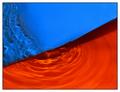
| 05/22/2003 03:34:27 PM |
submerged blue and orangeby deceptiveComment: Shots like this always amaze me, which, er, is partly because I'm very ignorant (not stupid, just ignorant). But still, nice, though I think I would have gone with a more yellow second colour to really get the contrast of the complementary colours -- this has a bit too much red in. |
| Photographer found comment helpful. |
| 05/22/2003 03:32:55 PM |
Spring Feverby severinComment: Very prettily staged, particularly the crisp focus on the leaf with the blurred background. Good colour contrast. |
| Photographer found comment helpful. |
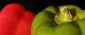
| 05/22/2003 03:23:34 PM |
Red & Green Peppersby WILDBLUEComment: Mmm. Salad.
Darn you! Now I want salad. Good photograph, good use of color and placement and background. Did you consider slicing them? Probably best you didn't, I would have been even mroe hungry. |
| Photographer found comment helpful. |
Home -
Challenges -
Community -
League -
Photos -
Cameras -
Lenses -
Learn -
Help -
Terms of Use -
Privacy -
Top ^
DPChallenge, and website content and design, Copyright © 2001-2025 Challenging Technologies, LLC.
All digital photo copyrights belong to the photographers and may not be used without permission.
Current Server Time: 08/17/2025 04:20:05 PM EDT.