| Image |
Comment |
| 05/23/2003 01:10:26 AM |
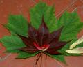
Red Maple ~ Green Mapleby ladpupmoeComment: I think, honestly, I would have preferred this without the floaters against the leaves. The colours of red leaf upon green upon the terra-cotta background would have quite sufficed and hit the topic spot-on. The floater additions distract and detract and make it look like you couldn't resist an arty touch that was wholly unnecessary. Mind you, it's a solid base idea and a good photo overall, despite my criticism. |
 Photographer found comment helpful. Photographer found comment helpful. |
| 05/23/2003 01:08:03 AM |
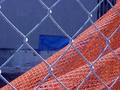
Urban Abstractby eloiseComment: Nice match of colour intensity on the contrasting two complementary tones. If this was mere happenstance as seems likely, very good choice of angles so that each colour gets about half the space. (It's good even if you did set it up, but it's harder when you work with what's there already, neh?) |
| Photographer found comment helpful. |
| 05/23/2003 01:06:41 AM |
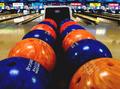
Cosmic Bowlingby AnachroniteComment: Ha! Good, very good. Alternating the colours works well, it's an unexpected setting, and the surrounding scene and background support it without drawing the eye away from things. |
| Photographer found comment helpful. |
| 05/23/2003 01:04:05 AM |
Her red silk scarfby jjbeguinComment: Ahh, excellent. A presumably-staged shot that has the air of spontaneity. Good colour choices, and nice interweaving between them. |
| Photographer found comment helpful. |
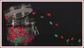
| 05/23/2003 01:01:48 AM |
The Great Escape by wayne9232Comment: Wow, I'm curious to see how you set this up. Very funny. PIty the greens weren't as bright as the red as the contrast of the complementary colours would have had a bit more impact, but this is a terrific way to hit the topic and provide a fun picture. |
| Photographer found comment helpful. |
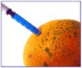
| 05/23/2003 12:59:49 AM |
A dose of the blues to cure the orange of the greensby moodvilleComment: You are a very strange person. Well, as obviously very set up shots go, this one definitely wins in terms of 'most unusual' -- it's not terribly arty or commercial, it's apparently just set up for the joke. Contrast wise between the sets of complementary colours, you did a fine job, particularly with the light angle given the orange the yellowish-fading-to-orange cast. About the only flaw perhaps is the white space is a little overwhelming -- maybe a slightly larger syringe with more blue would have cured this. |
| Photographer found comment helpful. |
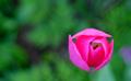
| 05/23/2003 12:57:24 AM |
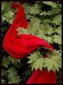
In Low Earth Orbitby magnusComment: I'm really running out of things to say about flowers against grass. As with a couple others, I think this would have worked better with a redder tone to the flower, nad I think maybe less blur of the greenery, but it's certainly topical and not by any means a bad shot. |
| Photographer found comment helpful. |
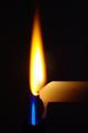
| 05/23/2003 12:56:28 AM |
Two Flamesby pinbackComment: Oh, keen setup. I do wish the flames had been closer in size; the yellow part of the image somewhat outdistances the blue as is. But definitely a nice exercise in the contrast. |
| Photographer found comment helpful. |
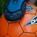
| 05/23/2003 12:55:31 AM |
Trappedby OneSweetSinComment: Kind of an odd angle -- I presume that's a shoe atop the ball but it looks rather flatter than I'd expect. Colour choices are good, with matching intensities where the complementary colours meet. |
| Photographer found comment helpful. |
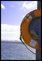
| 05/23/2003 12:54:17 AM |
Orange saver at the blue lakeby tyrkinnComment: Both the colour and the positioning of the close element versus the nice landscape help the life ring to stand out. The brightness of the sky does slightly diminish the impact (there's a lot of paler colour around the edges rather than a level of blue that matches the level of orange) but a different angle probably would not have worked as well for framing purposes so that's probably fine. |
| Photographer found comment helpful. |
Home -
Challenges -
Community -
League -
Photos -
Cameras -
Lenses -
Learn -
Help -
Terms of Use -
Privacy -
Top ^
DPChallenge, and website content and design, Copyright © 2001-2025 Challenging Technologies, LLC.
All digital photo copyrights belong to the photographers and may not be used without permission.
Current Server Time: 08/17/2025 04:19:56 PM EDT.