| Image |
Comment |
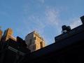
| 10/08/2003 07:41:17 AM |
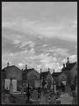
Necropolisby jjbeguinComment: Very imaginative title! Great shot, tricky to expose for and you managed very well. Effective composition. Nice use of duotone. I like the textures. 8 |
 Photographer found comment helpful. Photographer found comment helpful. |
| 10/08/2003 07:31:34 AM |
In Flightby mariomelComment: Wow, fantastic use of complementary colours. Great study in contrasts. Shame about the bird that's been cut in half by the spire. An unusual take on the challenge. 8 |
| Photographer found comment helpful. |
| 10/08/2003 07:26:17 AM |
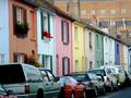
Kemp Street, Brighton, UKby Apollo2077Comment: There are so many rows of coloured houses like this in Brighton that I can't help feeling there must have been a better picture somewhere. I'd have tried to find a shot without cars. The building in the top right really doesn't look good. Great idea though. 5 |
| Photographer found comment helpful. |
| 10/08/2003 07:14:28 AM |
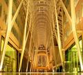
BCE Place, Torontoby timmiComment: This picture has a lot of potential, but the orange colour cast as a result of the wrong white balance really spoils it here. This is an amazing building... did you consider shooting in portrait orientation? This would have emphasised the height as opposed to the width. There is just enough floor to let us know it's there, but I find this a bit annoying... if the floor should be in the shot, then I think more needs to be made of it. There are so many great geometric shapes here, that I personally would have made more of them, going for a little more of an arty, abstract look than a snapshot, which is what this one looks like. 5 |
| Photographer found comment helpful. |
| 10/08/2003 07:07:01 AM |
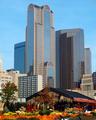
Fall in the Cityby goodtempoComment: Beautiful colours in the building, but I think you should only have pushed the blues and cyans as the foreground is too oversaturated. Perhaps some different cropping was required, there are just too many elements which take my eye away from the great building. 6 |
| Photographer found comment helpful. |
| 10/08/2003 07:04:20 AM |
New Yorker Hotelby jtnyComment: Fantastic, I love the light you've caught here, this was a good time of day for this shot. Great saturation. I like the grid pattern in the sky, although I'm not quite sure what it is. However, the composition doesn't quite work for me. In my opinion, the new yorker building needs to take up more of the frame. 7 |
| Photographer found comment helpful. |
| 10/06/2003 07:05:09 PM |
I dreamed I was young. Again.by pcodyComment: At first, I was going to give this a six, but it grabbed my attention and grew on me as I pndered on it. I'm not sure the title really helps you here, I think there are all sorts of ways to interpret this which should be left to the viewer and I wonder how many people are going to limit their appreciation of the shot by relying on the title to make sense of it. The combination of black and white and vivid red is very effective. The use of light and shadow, both of the sillhouette and the shadow of the garment is great. I love the composition. There is something very vivid and dreamlike about this shot. The use of shadow and red really communicate the feel of raising repressed sexuality through a dream environment. Ambitious stuff. 8 |
| Photographer found comment helpful. |
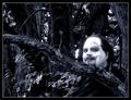
| 10/06/2003 07:00:20 PM |
The Lurkerby moodvilleComment: Fabulous shot, full of character. Great textures and composition. Effective range of tones, I like the low key background. Great model, very effective. Reminds me of German expressionist silent films. My only quibble is that the man's forehead looks a bit odd... there's a bit too much tonal contrast there. Shame you can't dodge and burn. Excellent work. 9 |
| Photographer found comment helpful. |
| 10/06/2003 11:15:56 AM |
Dreams of a photographer...by kosmikkreeperComment: Lovely shot, my favourite of the challenge. This is the best border I've seen on a photo at DPC, and really enhances the mood of the picture. Great idea for a dream... sex and photography! The fact that the woman has her back to the viewer really adds to the sense of mystery, along with the use of blue and rippley textures. The pictures on the wall are great, to me they represent the way that dreams have of uniting seperate elements that drift into consciousness. Excellent work. 10 |
| Photographer found comment helpful. |
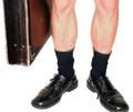
| 10/06/2003 11:11:54 AM |
First day at workby timboydwhiteComment: Great comical picture, with a lot of impact. Fantastic burnt out background. Good composition. Very imaginative. Shame about the glare on the shoes, but this is really a minor point. 10 |
| Photographer found comment helpful. |
Home -
Challenges -
Community -
League -
Photos -
Cameras -
Lenses -
Learn -
Help -
Terms of Use -
Privacy -
Top ^
DPChallenge, and website content and design, Copyright © 2001-2025 Challenging Technologies, LLC.
All digital photo copyrights belong to the photographers and may not be used without permission.
Current Server Time: 06/28/2025 10:26:10 AM EDT.