| Image |
Comment |
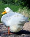
| 03/24/2004 10:37:19 AM |
WaterFowlby faidoiComment: Very cute... a little overexposed though, especially on his face where you have blown-out highlights. The rest of him could do with darkening so you can see more of the textures in the feathers. The whiteish foliage to his right in the background detracts a little, and the shadow detracts a lot. I think negative space is always needed in the direction that a person or animal is looking into. Here, you need more negative space to the left of the shot to give him room to look into. |
 Photographer found comment helpful. Photographer found comment helpful. |
| 03/24/2004 10:33:20 AM |
Weddings and Honeymoons (or Second Honeymoons)by TranquilComment: Shot seems to much like a snapshot. Too overexposed. The composition is not effective, it looks like the photographer wanted more of the gondola in the shot and misfired. The gondolier's face is obscured by his arm. The couple in the gondola are not interesting and look bored. The background does not look like it has been thought about. |
| Photographer found comment helpful. |
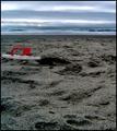
| 03/24/2004 10:30:13 AM |
Travel and Leisureby lizzyc3Comment: Very interesting composition, which invites the viewer to reflect on it for a while. Subtle and imaginative use of blue and red. Not sure what happened to your foreground texture though, it doesn't look good up close. Is this as a result of butchery by NeatImage? Maybe too much contrast? I would say that the overall mood, although very effective, is too drab and bleak for a tourism magazine. |
| Photographer found comment helpful. |
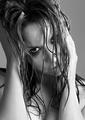
| 03/24/2004 10:17:13 AM |
Photo by DrJOnesComment: Wow, a stunning shot. Excellent model, great attitude. Very effective in b&w. Composition is excellent, I love the tilt of the head and the placement of the hands. Great use of water. The hair looks fantastic. Imaginative and effective crop. Only criticism is that in my opinion it is a little overexposed. This may have been intentional, but the effect doesn't quite work for me. |
| Photographer found comment helpful. |
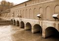
| 03/24/2004 10:14:00 AM |
HYDRO REVIEWby fisheyeComment: Nice level of detail in the foreground, but I think you needed greater depth of field. The foreground water seems a bit overexposed... if you haven't already I would decrease the contrast levels in your camera so you can capture a greater dynamic range and increase the contrast back in Photoshop. The composition seems to lead the eye out of the shot, which is not a good thing here. The eye should be led to a point somewhere in the picture, preferably at one of the thirds junctions. Not quite sure why you went for a sepia look here. The trees in the background take away from your composition. Not sure what you wanted to achieve here in general. |
| Photographer found comment helpful. |
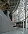
| 03/24/2004 10:10:06 AM |
Architectural Digestby dsrayComment: There are some very interesting elements to this composition, unfortunately the overall effect seems a bit chaotic. The reflections on the floor take away from the shot in my opinion. I think that the eye doen't have a natural resting place here, and that is what is needed... a focal point. |
| Photographer found comment helpful. |
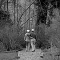
| 03/24/2004 10:06:59 AM |
The Golden Years - Springby zeuszenComment: Photo seems oversharpened, with too much texture and detail in your composition. The eye is not led to your chosen subject of the couple. It seems a bit offputting that they seem to be walking into a dead end... a bit unfortunate for a magazine aimed at older people! |
| Photographer found comment helpful. |
| 03/24/2004 10:03:57 AM |
Knowledge(drum&bass magazine)by litboltiComment: Great high-contrast shot, very idiomatic for your chosen magazine. The high-grain effect works nicely here. Not sure about the yellow tint on the lips. The reflections on the glasses take away from the effect a little for me. Great composition, I like the angle you got looking down on your subject. |
| Photographer found comment helpful. |
| 03/24/2004 10:00:59 AM |
Nickelodeonby cabaComment: Great subject, I like the reflection. The composition could be improved by not dividing your photo into two vertical halves, it's a bit of a cliche but I think that rule of thirds could have helped you here.Your subject needs more negative space to look into... I think you should have stepped back and allowed more space in the left side of the frame. I also feel that the colours are not saturated enough. The background definitely seems too grey. There is an unfortunate glare in the top-right corner of your subject which detracts a little. |
| Photographer found comment helpful. |
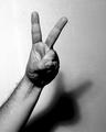
| 12/02/2003 10:39:44 AM |
Victory... or only shades Mr. Bushby cimarron98Comment: Critique Club:
I'm not sure I really understand the intention behind this photo. Is this the V for victory sign as used by Churchill? Where is the irony that the title hints at? Is this a pun on the title, where the shade is the shadow thrown by the hand? For propaganda, the image is not in any way hard-hitting enough as the message is unclear and ambiguous.
I'm not a fan of the burnt out highlights on the left side of the frame, and the noise levels in the shadow detract from the picture IMO.
The black and white works well here, and I like the tonal contrasts that can be found in the hand and arm.
In conclusion, I don't think the photo's message is communicated clearly enough for this to be an effective example of propaganda. I think you also need to watch out for overexposed highlights... I loved your shot of the child with dog which also sadly had burnt out highlights. |
| Photographer found comment helpful. |
Home -
Challenges -
Community -
League -
Photos -
Cameras -
Lenses -
Learn -
Help -
Terms of Use -
Privacy -
Top ^
DPChallenge, and website content and design, Copyright © 2001-2025 Challenging Technologies, LLC.
All digital photo copyrights belong to the photographers and may not be used without permission.
Current Server Time: 06/27/2025 04:41:52 PM EDT.