| Image |
Comment |
| 04/04/2004 03:52:55 PM |
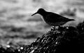
Bird silhouetteby helgihelgiComment: Nice shot, effective exposure. Very effective dof. Some great textures in here. Not 100% sure about the crop, the ratio of foreground to background seems a little off. I'd have liked more background I think. |
 Photographer found comment helpful. Photographer found comment helpful. |
| 04/04/2004 03:49:26 PM |
Fat & Sassyby scrum8Comment: Nice character shot, nice and sharp, effective dof. Some great textures. Composition works well. Tricky shot to expose for, nicely handled here. Not entirely sure about your border, I think a better one could have bumped this up a mark for me. |
| Photographer found comment helpful. |
| 04/04/2004 03:46:55 PM |
Evening In Marchby MonaComment: Beautiful sunset. I'd have made everything other than a sky a complete silhouette though, and spot edited out those lights. NeatImage would have helped the slight noise levels as well. |
| Photographer found comment helpful. |
| 04/04/2004 03:45:23 PM |
|
| Photographer found comment helpful. |
| 04/04/2004 03:44:22 PM |
Radiance At The Close of the Dayby HRoxasComment: Interesting sunset, a nice assortment of colours. The composition seems a bit haphazard though, I'd have looked for some strong shapes to silhouette and expoited rule of thirds. |
| Photographer found comment helpful. |
| 04/01/2004 11:39:54 AM |
Freedom Endangeredby chayes77Comment: Nice and sharp (perhaps only ever so slightly oversharpened), nicely blurred background. I'd have been tempted to apply NeatImage just to the background. However, you have chosen to centre your subject in the frame. This tends not to work to well with animals, as the point of focus is always the eyes, and here the eye looks as if it has not been placed at a deliberate point within the frame. I would have centred the eye, which would also have given the eagle some negative space to look into. Shame some of the white of the eagle's head has been cropped off. I think you could have brought out more highlight detail in PS. |
| Photographer found comment helpful. |
| 04/01/2004 11:34:36 AM |
Sweetie Pieby PaigeComment: Very nice shot, good character, well composed, good crop. Her hat seems much sharper than her face though, which leads my eye away from the face. IMO the eyes need to be the sharpest thing in the frame, as this is the point of focus. The face looks a little too smooth/ blurred, possibly as a result of NeatImage. Sometimes this is a nice effect on older models, but children don't need it. |
| Photographer found comment helpful. |
| 04/01/2004 11:31:28 AM |
Lazy on a Sunday Afternoonby TiberiusComment: Interesting shot... perhaps a little too like a snapshot. Slight overexposure resulting in burnt out highlights. The boy doesn't seem to be very sharp, and there is bad artifacting everywhere, possibly as a result of applying sharpening in PS to a photo that wasn't too sharp to start with. This particularly affects the texture of sand. Perhaps a little too much red overall. I think the main problem with this shot for me is that the viewer's eye is pulled in different directions. The two subjects are both looking out of the frame in different directions so there is no clear point of focus. |
| Photographer found comment helpful. |
| 04/01/2004 11:27:50 AM |
Concentrationby NazgulComment: Nice shot, very expressive tongue. Nicely blurred trees in the background. Not quite sure about your choice of blue here though. Great arms, but I'm not convinced by the crop. Well exposed. |
| Photographer found comment helpful. |
| 04/01/2004 11:24:55 AM |
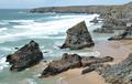
favourite coastlineby nordicComment: This shot doesn't do much for me I'm afraid. The sea is a little overexposed resulting in burnt out highlights. The overal picture looks a bit washed out, I think it could benefit from a bit more contrast. The picture could have been much sharper... maybe this is an issue with your camera. The dof seems a bit narrow, the background is less sharp than the foreground. Difficult to see why this happened, given that it is shot in bright conditions. I think you would have been better off focusing on a mid-point between the foreground and background to catch everything in focus. The composition in general seems a bit haphazard, maybe rule of thirds might have helped here. |
| Photographer found comment helpful. |
Home -
Challenges -
Community -
League -
Photos -
Cameras -
Lenses -
Learn -
Help -
Terms of Use -
Privacy -
Top ^
DPChallenge, and website content and design, Copyright © 2001-2025 Challenging Technologies, LLC.
All digital photo copyrights belong to the photographers and may not be used without permission.
Current Server Time: 12/20/2025 09:03:46 PM EST.