| Image |
Comment |
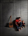
| 06/06/2007 05:54:33 AM |
Fender, Dave & Jakeby timfythetooComment: Nice mood, not sure about the composition though. What's with all the negative space on the left? Is Dave looking at Jake who's looking at the Tele? Perhaps you could have made a little more of that... Any reason for looking down on this scene? I may have prefered it with you on their level. I do like the negative space above them though, the texture of the wall is great. I like the feet, but maybe it could have been stronger if they both had bare feet? |
 Photographer found comment helpful. Photographer found comment helpful. |
| 06/06/2007 05:52:01 AM |
Crested Larkby SaraRComment: The bottom of the shot and the bird is great! The white sky is awful. The composition feels bottom heavy to me. I wish the bird was bigger... perhaps a tighter crop? Not sure about the oof grain on the right. |
| Photographer found comment helpful. |
| 06/06/2007 05:50:29 AM |
Pink Budsby kotzieComment: Nice study of shapes and textures, but the composition isn't strong enough. What is the point of focus? The trick is to lead the viewer's eye and give it flow. Here, the eye is led out of the shot in several places... it's not clear what is really important and why we should spend a while looking at it. What does it communicate? |
| Photographer found comment helpful. |
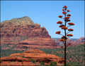
| 06/06/2007 05:48:03 AM |
Red Rock Countryby edmengComment: The wonky horizon really puts me off. Shot looks like it needs some colour balancing. Might work better if the background was more out of focus. |
| Photographer found comment helpful. |
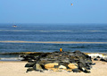
| 06/06/2007 05:46:23 AM |
A Bird, A Boat, A Boyby pipersdComment: Nice idea for the ooomposition... it doesn't quite work for me though, everything is too small. There's too much negative space that the bottom and right of the shot. The bird flying to the right on the right side of the photo means that the viewer's eye is led out of the photo... you should usually aim to put animals and animals facing INTO the rest of the photo. Same with the boat. |
| Photographer found comment helpful. |
| 06/06/2007 05:43:54 AM |
The Serious Walk Backby jaysonmcComment: Shame the grass around the feet is sho sharply in focus... traditionally it's the face which is razor sharp, everything else should be blurry. What you're communicating here is that you found the grass more interesting than the boy. |
| Photographer found comment helpful. |
| 06/06/2007 05:39:42 AM |
The Gamblerby fotomann_foreverComment: I would have prefered the focus on the gambler rather than the fruit machine. The background is definitely too cluttered which spoils the composition. The crop could be much tighter by removing the bottom of the shot. The face of the gambler is currently too high in the frame. The expression isn't amazing, this could be any fruit machine with any gambler at any point. The skill is to capture something a little unusual... a special moment. |
| Photographer found comment helpful. |
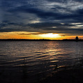
| 06/06/2007 05:36:26 AM |
Days Endby JamesKWComment: The world has many many sunset photos already, always ask yourself if you need to add another one! What do you want the viewer to focus on? Have you used any imagination with your composition? Putting something bang in the middle of the shot (horizon) is really only something you should do if you feel absolutely compelled to. Try to avoid it on the whole. The main problem here is the lack of interest in the shot to stop the eye going out of the frame. |
| Photographer found comment helpful. |
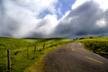
| 06/06/2007 05:33:43 AM |
Road To The Topby cogeroxComment: Striking shot, shame about the overexposed clouds. There's certainly enough shadow detail, I would definitely have brought the overall exposure down to keep detail in the highlights. Not sure about the placement of the horizon... it doesn't look like it was a deliberate decision to place it just below centre. PP has enhanced the textures of what may have been an okay photograph to one with more impact. |
| Photographer found comment helpful. |
| 06/06/2007 05:31:01 AM |
Angieby dsa157Comment: Not sure about the composition, why chop off a small part of the ear? I think more creative use of negative space could have transformed the photo, perhaps by including more space to the right and top. The shoulder works well in the composition tbough. The hair is a little messy, especially around her parting. The expression is not flattering, the crease between her eyes places a wall between her and the viewer. The mouth also seems to express displeasure. The face is slightly overexposed, especially the forehead and cheecks. |
| Photographer found comment helpful. |
Home -
Challenges -
Community -
League -
Photos -
Cameras -
Lenses -
Learn -
Help -
Terms of Use -
Privacy -
Top ^
DPChallenge, and website content and design, Copyright © 2001-2025 Challenging Technologies, LLC.
All digital photo copyrights belong to the photographers and may not be used without permission.
Current Server Time: 06/17/2025 05:22:32 AM EDT.