| Image |
Comment |
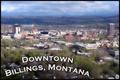
| 05/08/2003 02:25:21 PM |
Billings, Montanaby CLarson557Comment: Not a bad try, but I had to mark it down a bit. The choice of angle is nicely postcardy, but no postcard would smudge its subject up with that much blur and fog. There's also really no main 'thing' to look at - no focal point. One of those tall buildings could have been the star, or the mountains, or the (very pretty!) clouds, but as it is, nothing is but the text, and that's just an odd choice to have made. |
 Photographer found comment helpful. Photographer found comment helpful. |
| 05/08/2003 02:24:00 PM |
Philadelphia Museum of Artby ClubJuggleComment: Almost, but not quite. It's a decently interesting shot, but the composition is strange and an actual postcard-style angle wouldn't have had any trees obscuring the main point of interest. As it is, the eye is drawn first to the triangular pediment over the columns and then to the vast expanse of blank beige wall, leaving the viewer kind of foundering there. |
| Photographer found comment helpful. |
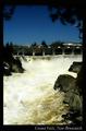
| 05/08/2003 02:16:14 PM |
Grand Falls, New Brunswickby JackoComment: Good concept, that's a postcardy subject all right, but your contrast is pumped WAY high. The water is blinding white, the sky almost twilight-dark, and the whole thing is painful to look at. The water's so bright you can't really see anything on it - it washes out the detail, and drags your eye down to something that isn't interesting to look at, rather than any actual focal point in the picture itself. The border and font label are just right for a postcard, though. |
| Photographer found comment helpful. |
| 05/07/2003 03:27:12 PM |
|
| Photographer found comment helpful. |
| 05/07/2003 03:25:51 PM |
|
| Photographer found comment helpful. |
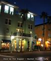
| 05/07/2003 03:25:12 PM |
Join us for Supperby CreativeFlyPhotoComment: The composition is juuuuuuust crooked-looking enough to make me feel like I'm the one that's aslant, slightly. Kind of uncomfortable. The lighting feels odd, too. Plus, I can't see it on a postcard, and since that's the theme ... |
| Photographer found comment helpful. |
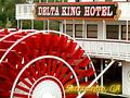
| 05/07/2003 03:24:27 PM |
The Delta Kingby ChrisW123Comment: Cropped a little too tightly for a classic 'postcard' look ... and, pardon me, but it's ugly. IMHO. :-> Nice focus and colors and contrast, though. It's just ... busy, and there's no compositional center. |
| Photographer found comment helpful. |
| 05/07/2003 03:23:11 PM |
Chimney Bluffsby wdebeau1Comment: This doesn't seem all that postcardy to me ... and just as an image, it's also not very interesting. There's no focal point, nothing for the picture to be 'about', per se, and the lighting is very stark, very plain. |
| Photographer found comment helpful. |
| 05/07/2003 03:22:23 PM |
breakthroughby helgihelgiComment: Gorgeous image, but not very postcardy, I'm afraid. What it really looks like is one of those Successories or 'Despair.com' motivational posters. |
| Photographer found comment helpful. |
| 05/07/2003 11:29:43 AM |
Young-Girlby terry139Comment: I don't see any glass. It's a lovely portrait, but technical quality and beauty are just two of the three criterion I grade on. The third is theme, and it's just as important. Good technique, beautiful shot, but I don't see how it fits the theme at all, so I have to grade it low. |
| Photographer found comment helpful. |
Home -
Challenges -
Community -
League -
Photos -
Cameras -
Lenses -
Learn -
Help -
Terms of Use -
Privacy -
Top ^
DPChallenge, and website content and design, Copyright © 2001-2025 Challenging Technologies, LLC.
All digital photo copyrights belong to the photographers and may not be used without permission.
Current Server Time: 08/04/2025 10:07:05 PM EDT.