|
|
|
Showing 111 - 120 of ~317 |
| Image |
Comment |
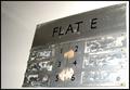
| 05/29/2003 04:06:24 PM | Flat Eby jaymeekaeComment: 5. Fits the theme well enough, and there are no blatant 'you suck!' flaws to it, but neither does it really grab me for any reason at all. For reasons of composition, cropping, or subject choice, it's just a photo, and doesn't do especially much for me, aesthetically. |  Photographer found comment helpful. Photographer found comment helpful. |
| 05/29/2003 04:06:16 PM | Home from Workby kavamamaComment: 5. Fits the theme well enough, and there are no blatant 'you suck!' flaws to it, but neither does it really grab me for any reason at all. For reasons of composition, cropping, or subject choice, it's just a photo, and doesn't do especially much for me, aesthetically. It's a ncie enough landscape, I suppose, but framing the red tree more interestingly might have made it pop. Pretty clouds, good lighting. | | Photographer found comment helpful. |
| 05/29/2003 04:05:47 PM | Welcome Homeby ScottKComment: 5. Fits the theme well enough, and there are no blatant 'you suck!' flaws to it, but neither does it really grab me for any reason at all. For reasons of composition, cropping, or subject choice, it's just a photo, and doesn't do especially much for me, aesthetically. | | Photographer found comment helpful. |
| 05/29/2003 04:05:41 PM | Bullhead City, Arizonaby tfarrell23Comment: 5. Fits the theme well enough, and there are no blatant 'you suck!' flaws to it, but neither does it really grab me for any reason at all. For reasons of composition, cropping, or subject choice, it's just a photo, and doesn't do especially much for me, aesthetically. | | Photographer found comment helpful. |
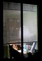
| 05/29/2003 04:04:38 PM | my laundryby TiberiusComment: 5. Fits the theme well enough, and there are no blatant \'you suck!\' flaws to it, but neither does it really grab me for any reason at all. For reasons of composition, cropping, or subject choice, it\'s just a photo, and doesn\'t do especially much for me, aesthetically.
The eye isn\'t drawn anywhere, though the colors and lighting are nice. A more directed choice of focus, combined with less muddy composition (meaning, what you want us to see is central, and the rest doesn\'t distract from it), might have helped a lot. | | Photographer found comment helpful. |
| 05/29/2003 04:01:07 PM | Where The Heart Isby ImagineerComment: 5. Fits the theme well enough, and there are no blatant 'you suck!' flaws to it, but neither does it really grab me for any reason at all. For reasons of composition, cropping, or subject choice, it's just a photo, and doesn't do especially much for me, aesthetically.
There's nothing the eyes are drawn to, other than the pair of birds. | | Photographer found comment helpful. |
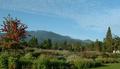
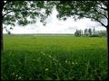
| 05/29/2003 03:58:53 PM | My own meadowby KINGComment: 5. Fits the theme well enough, and there are no blatant 'you suck!' flaws to it, but neither does it really grab me for any reason at all. For reasons of composition, cropping, or subject choice, it's just a photo, and doesn't do especially much for me, aesthetically.
Shot slightly differently, the same place and lighting might have given the flowers in front a starring role, or the trees on the horizon, or even the (fence? forest?) right at the horizon, or one of the trees to left or right. As it is, a flat expanse of grass is what the eye is most drawn to, and then there's nowhere else for it to go. | | Photographer found comment helpful. |
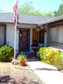
| 05/29/2003 03:57:07 PM | Homeby EJComment: 5. Fits the theme well enough, and there are no blatant 'you suck!' flaws to it, but neither does it really grab me for any reason at all. For reasons of composition, cropping, or subject choice, it's just a photo, and doesn't do especially much for me, aesthetically.
The lighting pulls the eye away from the door, but there's nothing in the well-lit parts to hold the eye either. | | Photographer found comment helpful. |
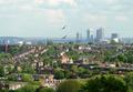
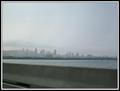
| 05/29/2003 03:55:34 PM | Montreal - My home sweet homeby RawkgurlComment: 5. Fits the theme well enough, and there are no blatant 'you suck!' flaws to it, but neither does it really grab me for any reason at all. For reasons of composition, cropping, or subject choice, it's just a photo, and doesn't do especially much for me, aesthetically.
If it weren't so grey and hazy, it might have more personality; if the buildings were bigger, or the sky more interesting, likewise. | | Photographer found comment helpful. |
| 05/29/2003 03:53:42 PM | Home Sweet Home of Our Ancestorsby pncowleyComment: 5. Fits the theme well enough, and there are no blatant 'you suck!' flaws to it, but neither does it really grab me for any reason at all. For reasons of composition, cropping, or subject choice, it's just a photo, and doesn't do especially much for me, aesthetically. | | Photographer found comment helpful. |
|
Showing 111 - 120 of ~317 |
Home -
Challenges -
Community -
League -
Photos -
Cameras -
Lenses -
Learn -
Help -
Terms of Use -
Privacy -
Top ^
DPChallenge, and website content and design, Copyright © 2001-2025 Challenging Technologies, LLC.
All digital photo copyrights belong to the photographers and may not be used without permission.
Current Server Time: 08/04/2025 02:54:32 PM EDT.
|