| Image |
Comment |
| 11/05/2005 05:44:09 PM |
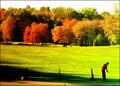
"Far too busy to go to work today!"by trobergeComment: The colours of this photo are incredibly vivid, and i think it works very well for the trees, but to me all the grass is so bright that it looks a little fake/overprocessed. (-: |
 Photographer found comment helpful. Photographer found comment helpful. |
| 11/02/2005 12:11:43 AM |
|
| Photographer found comment helpful. |
| 10/31/2005 01:04:08 PM |
See-Through Silhouetteby owenComment: i really like this image, especially that the reflection has some detail in it. The guy looks to me, like he's smiling... happy to be out and about and photographed. -10 (for sheer coolness) |
| Photographer found comment helpful. |
| 10/31/2005 11:08:15 AM |
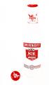
Invisibly Transparentby joezlComment: Maybe a little silly, but why would the bottle have a cap on if there is a cap to the side?
The image is well composed, but it might be nice to have seen the edges of the bottle (even really faintly), though I suppose that was for the 'transparency' part of the challenge... (-: |
| Photographer found comment helpful. |
| 10/31/2005 11:04:12 AM |
Clear indulgenceby dmmontyComment: I like porto, and the distorted bottle is really clear and has an interesting shape, but perhaps a colour other than orange/yellow could have been chosen for the backgroud? It's so bold, it almost overpowers.
nitpick: way off to the left by the border there seems to be a little extra line (missed when cloning out??) |
| Photographer found comment helpful. |
| 10/31/2005 12:26:11 AM |
Samara by kiwinessComment: wow. creepiness. Tthe colours of the place for some reason make me think of a church, which makes it doubly so. I don't know if it was possible with the pic, but personally I would have liked to see a bit lower of a crop (more desk/computer), as I think the top third of the image is a bit distracting rather than aiding the overall picture. (-: -7 |
| Photographer found comment helpful. |
| 10/31/2005 12:18:35 AM |
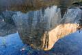
Merced Riverby bryanbrazilComment: This has beautiful colours and great clarity. I don't know if you tried flipping the image, but to me (holding my computer upsidedown), it's a bit more intriguing that way, and I think either way it's hard to miss that it's a reflection.. (-: -7 |
| Photographer found comment helpful. |
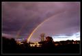
| 10/28/2005 10:31:52 PM |
Rainbowsby FlashComment: I love the way you really brought out the colours of the rainbows here. They're incredible. I don't know if it's due to that, but the sky is really purple, which looks a bit odd to me. And I find the dark bottom to be really heavy, almost overpowering the rainbow's brilliance. (-: -6 |
| Photographer found comment helpful. |
| 10/28/2005 01:21:43 PM |
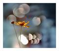
My Son, the Poetby mannjuditComment: I'm glad that someone put a picture of a guy in here too... being a little tired of only girls being 'delicate'... though i don't really think that all the motion blur adds that much to the pic. |
| Photographer found comment helpful. |
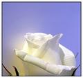
| 10/28/2005 01:15:40 PM |
Open ..upby tfarrell23Comment: This is a beautiful image, though i would have loved to see more of the rose (and maybe less of the blue). -7 |
| Photographer found comment helpful. |
Home -
Challenges -
Community -
League -
Photos -
Cameras -
Lenses -
Learn -
Help -
Terms of Use -
Privacy -
Top ^
DPChallenge, and website content and design, Copyright © 2001-2025 Challenging Technologies, LLC.
All digital photo copyrights belong to the photographers and may not be used without permission.
Current Server Time: 08/17/2025 12:48:26 AM EDT.