Days Gone Byby
esdarbyComment: Hello from the Critique Club!
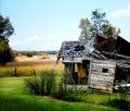
The first thing that struck me about this image is the beautiful colours of the house and the field behind. I love the saturation.
It fits the challenge very well (to me), and as I said, I enjoy the colours; though it might also make a striking black and white, this way it has an individual character.
I think that the sky is a bit overbright, it steals away some of the focus that could otherwise be on the house.
The focus/sharpness is really good, though I did notice that along the bars of the window, the lines look a bit choppy. Perhaps by using a larger aperature, for more depth, this could be avoided.
For composition, again, the sky is stealing focus away from the theme of your image. The top centimeter or so is only sky, and does not need to be included in the image... I'd suggest cropping off a bit of the top, and then maybe fiddling with cropping on the bottom and sides, to put better focus on the house.
Two other little things I noticed are:
- the right side of the house is dark and empty, which distracts me from the busy dissaray beautifully portrayed in the left.
- along with the right side of the house, there are four dark areas, all along the side -- the grass bunch, the shadow in the grass, and the tree... While they aren't all really distractions, I find that they do not add to the photo as a whole. (Which is why I suggested playing with the cropping along the sides and bottom as well.)
Congrats on the score, and good luck in all future challenges!
--Mariana (funnylooks)
Feel free to PM me with any questions/comments.