| Image |
Comment |
| 08/13/2003 10:24:27 AM |
|
 Photographer found comment helpful. Photographer found comment helpful. |
| 08/06/2003 09:44:01 PM |
Window Boxby lecalanComment: Right Angles - yes; Strength of the image - No.
Good picture composition and lighting. If you had a way of removing the reflections it would be even better. |
| Photographer found comment helpful. |
| 08/06/2003 09:08:58 AM |
Digital At Right Anglesby mohamedsaifComment: I cannot tell what the picture is of, I think it is something light projected onto something (either glass or the camera lens itself). Also I do not see a strong right angle. I do see a weak angle if the linear average of the liight was reduced to a line.
Technically, good color in the foreground, though the left to right brightening is a little distracting. A tad sharper would have been nicer, and if the stuff in the background is not supposed to be in the picture, have it covered or removed if possible. If it is supposed to be in the shot then it needs more light or contrast on it to bring it into the picture. |
| Photographer found comment helpful. |
| 08/06/2003 07:44:06 AM |
Sleeping tightby MjrTomComment: I have to say the image needs more pop in colour,either foreground or background to give it some flavor. That and some angles that "produce the strength of the image" to meet the challenge. |
| Photographer found comment helpful. |
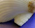
| 08/06/2003 07:37:16 AM |
Right Angle Found in Natureby n2kajaComment: Technically the picture is okay. But in a day when the challenge definition rules, the one right angle shown does not "produce the strength of the image". When I view the strength comes from the graceful swooping curves of the shell. |
| Photographer found comment helpful. |
| 07/30/2003 09:34:39 AM |
Rock Garden Sunsetby jerrftComment: Maybe some fill lighting to re=move some (but not all) for the shadows. The tight shadows where two rocks meet is good, the flowing shadow that obscurs half of a rock in darkness is not as good. Great background sky. |
| Photographer found comment helpful. |
| 07/30/2003 08:54:28 AM |
A Pavilion in the Gardenby bsaluComment: While I don't see anything technically wrong with you shot (in my admittably amatuer eye). there is a blandness (not wahsed-out) feeling to the picture, either the colours don't pop enough, or the hue is overall too green (even the pavillion is taking on the tint).
Either pushing the colour saturation up to get more pop between the different shades of green, or desaturating the green slightly to wash it out and adding in some colour for a secondary focal point (perhaps a forgotten red sweater on the pavillion bench) with the saturation on that colour pushed up. I can see a purple flower and a red (fish?!? maybe) in the pond. That lead the eye in a trail of colour to the pavillion, some colour at the finish line may have helped. |
| Photographer found comment helpful. |
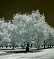
| 06/25/2003 02:06:42 PM |
The Orchardby Chilly0999Comment: Love it. I would have reduced the negative space at the top by about 3/4, but then I'm not a fan of negative space. I would like to see the orignal and find out what settings you used for the colour leveling . |
| Photographer found comment helpful. |
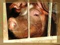
| 06/25/2003 01:41:53 PM |
Pigby giampoComment: I don't care for the transparent border, but the pig sure looks happy! |
| Photographer found comment helpful. |
| 06/25/2003 09:33:21 AM |
Barb on Fogby Ric371Comment: Great shot, but a little more detail on the subject would have been appreciated. I love the natural softness that the fog provides on the background. |
| Photographer found comment helpful. |
Home -
Challenges -
Community -
League -
Photos -
Cameras -
Lenses -
Learn -
Help -
Terms of Use -
Privacy -
Top ^
DPChallenge, and website content and design, Copyright © 2001-2025 Challenging Technologies, LLC.
All digital photo copyrights belong to the photographers and may not be used without permission.
Current Server Time: 08/01/2025 08:58:19 PM EDT.