| Image |
Comment |
| 04/28/2005 05:47:34 PM |
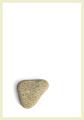
Minimalist Beachby PaulMdxComment: Love the title. This works on several levels. I'd love to see the rock just a bit more in focus. |
 Photographer found comment helpful. Photographer found comment helpful. |
| 04/28/2005 05:32:34 PM |
|
| Photographer found comment helpful. |
| 04/28/2005 05:28:42 PM |
Out of Wall St.by charmayneComment: Dramatic lighting. Nicely composed. Fits the challenge really welll. Image is noisy. A quick run thru Neat Image really makes it look nice. |
| Photographer found comment helpful. |
| 04/28/2005 05:26:33 PM |
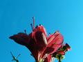
Black Tulipby peeceeComment: I like the shot, but the subject is too big. Well framed, nice DOF, good color levels. |
| Photographer found comment helpful. |
| 04/28/2005 05:23:14 PM |
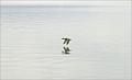
Early Morning Flightby saiphfireComment: Very nice shot. I'd like to see the bird more to one side or the other, rather than dead center. A little saturation boost might help, too. |
| Photographer found comment helpful. |
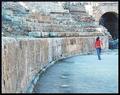
| 04/28/2005 05:21:54 PM |
minimalism ruinsby anatolio25Comment: I don't think this fits the challenge. Maybe if you had titled it to make the viewer think the girl is the subject, it would work better. Too grainy or something. Looks like some kind of texture filter was applied to the image. |
| Photographer found comment helpful. |
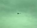
| 04/28/2005 05:18:50 PM |
News Chopperby MacguyverComment: Well, you've probably already been told this, but it's too green. Fits the challenge, but the framing is uninteresting. I like that you can see the "4" on the copter's side. |
| Photographer found comment helpful. |
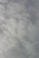
| 04/28/2005 05:16:51 PM |
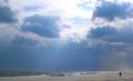
Flying Highby sandabellaComment: Fits the challenge really well. Sky colors look a little flat. Nothing looks really well-focused, but that's hard to do with clouds. Nice crop, but I'd try rotating to horizontal so the plane doesn't look like it's in a nosedive. |
| Photographer found comment helpful. |
| 04/28/2005 05:14:50 PM |
|
| Photographer found comment helpful. |
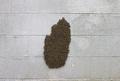
| 04/28/2005 05:07:17 PM |
bee hiveby aplomb76Comment: Tough shot to carry off. If the subject is made smaller, it becomes unrecognizeable. As is, however, I think it's too large a piece of the picture. Maybe composing the shot with the bees far to one end of a more stretched-out image? |
| Photographer found comment helpful. |
Home -
Challenges -
Community -
League -
Photos -
Cameras -
Lenses -
Learn -
Help -
Terms of Use -
Privacy -
Top ^
DPChallenge, and website content and design, Copyright © 2001-2025 Challenging Technologies, LLC.
All digital photo copyrights belong to the photographers and may not be used without permission.
Current Server Time: 08/21/2025 03:49:10 PM EDT.