|
|
| Image |
Comment |
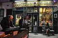
| 02/23/2011 08:13:48 PM | Shakespeare and Company  by JimiRoseComment: I remember going in here! :D How wicked is that, unfortunate they were selling the twilight series, they had an entire shelf dedicated to it! ^_^ |  Photographer found comment helpful. Photographer found comment helpful. |
| 11/18/2010 12:19:59 AM | | | Photographer found comment helpful. |
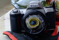
| 10/17/2010 05:57:35 PM | Redneck Fish Eye Lens by MelonMusketeerComment: Originally posted by tome:
From the thumb I thought it was a broken lens.
Then I wished it was, a broken lens.
:) |
It probably is now... | | Photographer found comment helpful. |
| 10/14/2010 09:02:37 PM | | | Photographer found comment helpful. |
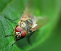
| 08/04/2010 04:52:13 PM | Hey Whassup!by sekarmalathyComment: Greeting, from the critique club!
This shot, in my opinion, is near-perfect. There is nothing computationally of technically that could have been done any better, unless you got a little closer to the fly. At this distance, and using the 90mm, you did pretty well. Maybe it's just me, but would have like to have seen just a bit more of the fly in focus. Even though it's shallow DOF, I think you might have gotten a higher score if you used something like f/15 and got the feet, head and just a bit of the wings in focus. That would have kept me looking at the shot a bit longer.
It's hard to critique such a fantastic capture like this one. So, you get the gold!
- Jackson
(btw, clever title) | | Photographer found comment helpful. |
| 07/28/2010 12:30:32 AM | | | Photographer found comment helpful. |
| 07/23/2010 01:39:56 AM | | | Photographer found comment helpful. |
| 07/22/2010 01:53:29 AM | Perfect product placementby herfotomanComment: Maybe it's just me (and it seems like it is), but this shot deserved a score more along the lines of 6.3 or 6.4.
+1 for cleverness in the title
+2 for excellent and creative crop/composition
+2 for beautiful imagery, quality and detail on the subject
+2 for good subject posture and expression
-1 for blown highlights on his hat
Fantastic. It's good, real good. This deserves "a longer look" from the voters. You were cheated. Part of it may be the "product placement" in the title, people didn't get it, and/or didn't think it fit perfectly with their description of he challenge.
I faved this, and I don't fav much.
ETA: Need to see more detail, sharpness, and/or focus on the coke can and the guy's face. Message edited by author 2010-07-22 01:54:59. | | Photographer found comment helpful. |
| 07/16/2010 10:00:00 PM | Caught in the Crossfireby MeMex2Comment: Greetings from the Critique Club!
Alright, first thing I think of when looking at this is "antique". That's good since I'm assuming that's the feel your going for. The tones, hue and detail all play into this and were done very well. The muted tones on the guns are beautiful.
The real start of the photo is the model. His expression, the button on his shirt, the number on the glass projected onto his face, all icing on the cake. The guns going back seem infinite, and really make the shot fantastic. Great work!
The first thing I can see here is that the photo is a bit too grainy for my taste. Maybe that was intended, but I think, there could be a bit less.
Secondly, The tones on the subject seem a bit TOO muted. Just as on the bottom-left gun, there could be a tad more contrast.
That's all I can say. Great work, fabulous photo, and this definitely deserved a higher score.
- Jackson Gariety | | Photographer found comment helpful. |
| 07/16/2010 08:19:08 PM | silenceby gazdiComment: Interesting shot. First thing I noticed was the the person and her hair does not stand out enough in the photo. Maybe altering the tones of the background or changing your lighting situation would help that. Second, there seems to be a lack of detail in the hair. Maybe it's just out of focus, but I would LOVE to see the same amazing detain you captured on the face to be in the hair.
Nice composition, but the hardest thing about this shot would be the lack of detail in the hair. Otherwise, fantastic! | | Photographer found comment helpful. |
Home -
Challenges -
Community -
League -
Photos -
Cameras -
Lenses -
Learn -
Help -
Terms of Use -
Privacy -
Top ^
DPChallenge, and website content and design, Copyright © 2001-2025 Challenging Technologies, LLC.
All digital photo copyrights belong to the photographers and may not be used without permission.
Current Server Time: 07/30/2025 04:12:22 PM EDT.
|