| Image |
Comment |
| 05/02/2008 05:34:28 PM |
|
 Photographer found comment helpful. Photographer found comment helpful. |
| 04/08/2008 11:30:07 AM |
Just Thinkin'by karmatComment: While I love her expression, I'm a Philistine in that I don't care for the fad of portrait shots that chop off part of the head (usually the top - the top "corner" of her head in your case). If it was widened out just a bit more (at least past her hairline), I might like it better.
Also, as mentioned by surfdabbler, it seems to be not-quite-high-key. That gives it a slightly unfinished feel, which may have been noticed on a gut level.
It's still much nicer than most "professional" portraits. |
| Photographer found comment helpful. |
| 04/08/2008 11:18:01 AM |
Curtis Fallsby surfdabblerComment: It's not the log that bothers me (although it does pull focus), it's the brown stuff under the water to the right of it. It almost seems to be a shot of it's own added on to the waterfall shot.
What if you sliced this down the center (or just to the right of center - maybe including all or part of that central fern?) and then cropped a bit off the bottom?
Just a thought. |
| Photographer found comment helpful. |
| 04/08/2008 11:11:54 AM |
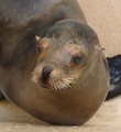
I am smiling!by actnoutComment: Just to say something different -
There's something about the angle of this shot that takes the "life" out of th eyes. This could be taxidermy (although if it were, it would be much easier to follow the others advise and get in closer).
It also seems a bit like you were torn between using just the face, or the entire front half of the seal in the composition. When I do this, it always turns out wrong, lol. A landscape crop that showed that front flipper (even w/ the short focal lenghth), or maybe both front flippers might work better, so might a tighter crop on just the cafe (although that probably isn't a good idea given the resolution). |
| Photographer found comment helpful. |
| 04/02/2008 11:04:21 AM |
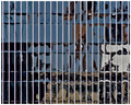
Silent Movieby Les_FeckComment: To answer your last question first - Yes! lol
I'm one of your 8s. I loved this, your title made me think of it as "movie poster" art. Not exactly what you intended, but I still think you should have scoredd higher. Guess it's the bias against abstracts. Even though thtat shouldn't be the case in a "Pattern" challenge.
I did see the lines more as negative space elelmets - to me the pattern (not a recurring symetrical one, obviously) was the horizontal lines of the reflection. I kept trying to see faces (who's the star of this movie? lol). |
| Photographer found comment helpful. |
| 04/01/2008 04:23:31 PM |
|
| Photographer found comment helpful. |
| 04/01/2008 04:15:21 PM |
Winter's Last Gaspby KenComment: The blur in the greenish area of the water pulls focus for me. Would this look better if that was cropped out? |
| Photographer found comment helpful. |
| 04/01/2008 04:12:49 PM |
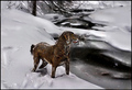
Wonderlandby IvoryComment: I'm not a big fan of HDR, and here it's making the dog look more like taxidermy. |
| Photographer found comment helpful. |
| 04/01/2008 04:11:29 PM |
Jacquelineby Sunshine86Comment: Something (makeup or lighting?) makes it look as though the hand belongs to someone else. This (and the darkness of her forehead and eye area) pulls focus to the wrist for me. |
| Photographer found comment helpful. |
| 04/01/2008 04:08:28 PM |
|
| Photographer found comment helpful. |
Home -
Challenges -
Community -
League -
Photos -
Cameras -
Lenses -
Learn -
Help -
Terms of Use -
Privacy -
Top ^
DPChallenge, and website content and design, Copyright © 2001-2025 Challenging Technologies, LLC.
All digital photo copyrights belong to the photographers and may not be used without permission.
Current Server Time: 08/26/2025 01:21:16 PM EDT.