|
|
|
Showing 141 - 150 of ~867 |
| Image |
Comment |
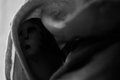
| 10/06/2010 11:17:55 AM | Thumbelinaby posthumousComment: Posthumous again? Not sure if I got lucky, or you got unlucky, but here goes with the critique...
Overall, this is a very interesting shot, but more 'art gallery' than 'DPC' which probably explains how the voters have judged it. I suspect that you knew this already so I won't dwell on it!
Technically: It strikes me that this shot is technically very accomplished. Your use of DOF and spot on focus is excellent and the way you have chosed to light this shot - while not popular - is intriguing. Instead of a thumb with a face painted on it, we have a dark icon, in which the white bits end up looking quite ghostly.
Artistically: The composition is very powerful, using the OOF leading lines of the curtain to draw the viewer in to the deep dark heart of Thumbelina, and guess what is actually there. As someone said previously, the curves and shapes are great, as is the BW conversion. If I was to criticise, it would be the brightness of the wall (?) to the left. While this does contrast with the darkness of Thumbelina, it also drags the eye away from her in a slightly distracting way - I would be tempted to tone it down, but that is obviously subjective.
In summary, this was never going to have mass appeal, but it is a wonderfully dark take on the theme which has clearly appealed to those who have taken the time to soak it up. |  Photographer found comment helpful. Photographer found comment helpful. |
| 10/04/2010 11:26:45 AM | My mother  by svavaComment: Hi from the Critique Club. It is always hard to critique a really good photo, let alone a ribbon winner, but I'll give it a shot!
Overall, I liked this from the moment it came up on the screen. I was immediately grabbed by the piercing stare and the wonderful expression of your model. I'm not sure she does succeed in hiding her sense of humour - she does look as if she is hiding a smile, like the Mona Lisa.
Technically: Superb in every respect - except for the handbag lighting. It took a moment, but the glare did start to drag my eye away from the rest of the shot.
Artistically: The placement of the model and chair diagonally across the frame is very strong, and posing at a alight angle like the statesmen and soldiers would in their (painted) portraits gives her a real strength. She is also beautifully framed by the shape and pattern of the chair, which emphasises her posture.
PP: It is (as others have said) a very good BW conversion. If I had a slight criticism, it would be a suggestion about using a little 'burn' on the handbag and hands, since they have reall caught the light - but this is a small thing.
In summary, it is clearly an excellent shot, which has been recognised by the voters. Good job! | | Photographer found comment helpful. |
| 10/04/2010 10:51:42 AM | forgottenby jbrobesonComment: Hi, you asked for a critique, so here it is. Obviously the whole thing is completely subjective so I just hope you find a couple of useful nuggets in here!
Overall, my take is that I like your concept; putting the classic 'Scandal' pose into a decaying building is interesting and effective.
Technically: Your DOF and focus is spot on. For me, the background is as important as the subject, so keeping it all in works really well. If it was feasible to judge it so that the view outside of the window was OOF, that would be gravy but probably quite tricky! I think that you made the right choice on the lighting, using fill flash, but a gel or tinted reflector might have been fairer to the model, as the current flash (for me) highlights the white of the inside of her leg.
Artistically: It is interesting that you have her offset on the window, but centred in the shot, rather than setting her a little off centre, I think that this does work to add to the 'portrait' feel. Certainly not cropping too close gives a great sense of the environment which you were keen to shoot. The model's pose is great, tense at the bottom, relaxed at the top to keep one guessing - but her face looks apprehensive rather than inviting, and I am not sure this fits with the rest of the picture.
In summary, it is very nice to see a different take on the challenge, and it was very well realised, scoring deservedly well as a result. | | Photographer found comment helpful. |
| 10/03/2010 10:49:10 AM | Softlyby Ja-9Comment: Ja-9, I can't believe you even asked for a critique on this! What am I supposed to say??! I'm afraid it's going to be quite short.
This shot is simply stunning. Technically flawless. All the usual comments (needs to be sharper, needs more contrast, get rid of the distracting bit) simply don't apply.
If I was going to tweak one thing, I would crop the right hand side about an inch tighter, so that there was no 'non-flower' space in the shot. IMHO it doesn't really need it.
Visually, the curves, the even increasing sharpness and contrast as we delve into the heart of the flower, the offset gently lighting... it is all so very appealing. I wonder how long you searched for such a perfect bloom?
Outstanding job, I applaud you. | | Photographer found comment helpful. |
| 10/03/2010 10:43:21 AM | Miniature Moose Migrationby zencowComment: Hi Zencow, you asked for a Critique, so here it is!
Overall, this is a very pleasant shot, with a fairly abstract look which I find appealing. Most of the High Key entries are BW, but the pastel colours in this give it a lovely dreamy feel so colour was (IMHO) the right choice here.
Technically: Where you have focussed, it is good and sharp, but the DOF is very limited. You have used f5.6 while either very close, or using quite a long focal length and as a result both foreground and background are OOF. While I get that you may have been going for this, it makes letting the photo 'lead' my eyes tricky since there is no obvious start point. The exposure is perfect, but for a high key challenge I would have been tempted to boost it a little.
Artistically: This is completely subjective, and obviously my opinion only! The composition is spot on, with all of the major points of interest hitting that rule of thirds. It only lacks the leading lines to be textbook stuff.
PP: There are some tweaks I would have made to make this stand out from the crowd a little more. Again, personal choice. I would have boosted the exposure at RAW conversion (if applicable) to give the high key look, and then used some more curves to boost the contrast and show off those exciting 'leaf' edges. If I was being cynical, I would have also sharpened it a little (or a little more?) after resizing for DPC again to show off the edges and the detail of the tiny hairs which you have captured. I might also have reduced the saturation on the green selectively to get rid of the green blob in the low middle - its a bit distracting.
In summary, its a lovely shot which I reckon just needs a little more 'pop'. Not being really obviously 'high key', and not being of a pretty flower or DPC friendly child probably killed your score, but that happens to so many great shots here that I wouldn't let it put you off. The voters are fickle! | | Photographer found comment helpful. |
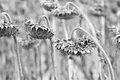
| 10/02/2010 08:22:08 AM | prayersby posthumousComment: Hi! It is a challenge to 'critique' such an established artist, but I'll give it a shot...
My overall view of this is that you have taken something 'ordinary' - even something that most would shy away from since it is dying, and made something very beautiful from it. The title is perfectly chosen, but the photo stands well with or without it.
Technically: There is nothing I can usefully add - the DOF is perfect, using the flowers at the back as a never ending congregation and the focus on the front subjects is bang on. The lighting is also excellent, and - I suspect - natural? For a true high key, you could have gone lighter with this, but that might have detracted from it's 'natural' appeal.
Artistically: Very hard to say since this is such a subjective thing. My personal take is that the concept is great, the curves of the stems and the positioning of the heads is very appealing. I think a couple of elements impact negatively though: the cutting off of the left hand flower and the slight extra bit on the right hand side half way up are slightly distracting, as is the glare on the right hand stem.
PP: The BW conversion is spot on - I would normally go a bit darker but that is personal taste, and this is after all a high key challenge!
In summary, I think it's a great shot. I would have probably expected this to end up in the low to mid sixes. I think in this case it is only voters being sticklers for their interpretations of high key that stopped that happening. | | Photographer found comment helpful. |
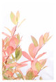
| 10/01/2010 05:52:38 PM | Fire Bush at fallby michelaudetteComment: Hi! Welcome to your (very amateur!) critique.
My overall impression of this shot is that it should have done better. It is a beautiful concept, very well realised. I think that there are a couple of minor points which may have held it back.
Technically: Actually I don't really have anything to add. I suspect that your prep for the shot (with the white board) saved an awful lot of PP work.
Artistically: The colours are excellent, giving the whole a superb dreamy quality. The composition is quite strong, but I would probably have cropped the top all the way down to the top leaf - I am not sure that the white up there adds a lot. The white vignette also probably put some voters off. I can see that this might have been intended to add to the dream quality, but I am not sure it works. A hard white border might have been better.
PP: This could have been sharper, but I think you were right not to make it so. You would have lost some of that dream quality. What I would recommend is to use the freedom of advanced editing and clean up the edges - there are some odd yellow lines in the vignette which are distracting and a linear shadow bottom right which I would have dodged out - again it is distracting.
In summary, I like this. I didn't vote but would have gone for either a 6. With some of the details cleared up probably a 7. Nice one! | | Photographer found comment helpful. |
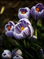
| 10/01/2010 05:41:49 PM | Stareby Silent-ShooterComment: My first critique - so go easy on me!
My overall view is that this is a very strong portrait, which rightly did very well, hence the very justified high final score. Anything critical I have to say is, therefore, going to be strictly nitpicking, but here goes:
Technically: This should have a decent DOF with f6.4 at 50mm at this sort of range, but it looks remarkably shallow - her hair is perfectly focussed but the eyes seem just a tiny touch soft. If the hair wasn't perfect, I would think that this might be the result of re-sizing - you don't mention sharpening after resize, which I always find worthwhile as the sizing process plays hell with sharpness. The lighting is perfect with beautiful catchlights.
Artistically: I really like the framing of the face with the veil, particularly for the high key challenge it works really well. You clearly chose to stick with the 3rds convention and that it effective to. It wouldn't be fair of me not to finally give props to your model, who has given you a fantastic expression to capture here.
An excellent job, resulting in a pretty decent score. | | Photographer found comment helpful. |
| 10/01/2010 05:22:53 PM | Contrasting Purpleby ScooterMcNuttyComment: First time I have seen this - all I can say is that I hope we are on the same team again next time DPL runs! Outstanding work. | | Photographer found comment helpful. |
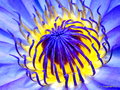
| 09/29/2010 07:16:06 AM | RAPSODY IN BLUEby eyeartComment: May I comment?
Artistically, I love the composition on this. The angle of the shot is spot on. The colours are pretty good - particularly the glowing gold in the centre. The purple blues are also fine in the heart, but around the edge they seem a little light and I feel it loses impact.
Technically, it is a little noisy and a little soft for a macro. Assuming this was taken using a tripod and remote release, it doesn't need to be ISO 400, ISO 100 should be fine. You probably need an aperture of f11 or greater to get the depth of field this needs at this range.
Post processing, I don't know what you have done, but I would use the unsharp mask (USM) tool on most shots, initally on the full size version, then (if re-sizing for DPChallnge) again once you have got it down to the 800px version - this should give you the sharp look a shot like this needs.
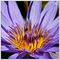
This was my take on a similar flower (not shot with a Macro lens though):
 | | Photographer found comment helpful. |
|
Showing 141 - 150 of ~867 |
Home -
Challenges -
Community -
League -
Photos -
Cameras -
Lenses -
Learn -
Help -
Terms of Use -
Privacy -
Top ^
DPChallenge, and website content and design, Copyright © 2001-2025 Challenging Technologies, LLC.
All digital photo copyrights belong to the photographers and may not be used without permission.
Current Server Time: 08/20/2025 04:33:49 AM EDT.
|