| Image |
Comment |
| 08/01/2003 03:37:34 PM |
|
 Photographer found comment helpful. Photographer found comment helpful. |
| 07/31/2003 11:55:37 AM |
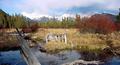
Rock Garden Sunsetby jerrftComment: I love this. I don't know why. I don't usually like this sort of thing.
The roundness and smooth quality of the stones, and the way they are stacked creates a sense of tentative balance. The lighting is perfect and the colors amazing. This is - imho - very Zen (in my limited understanding of the word). Marvelous interpretation. Marvelous job! |
| Photographer found comment helpful. |
| 07/31/2003 11:51:57 AM |
Wheelbarrowby EddyGComment: beautiful use of light.. great how the rows lead my eye into the photo. a bit overexposed in some of the bright greens.. but I think the whole image works well. |
| Photographer found comment helpful. |
| 07/31/2003 11:49:38 AM |
|
| Photographer found comment helpful. |
| 07/31/2003 11:47:45 AM |
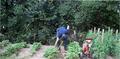
Gardeningby Crafty SueComment: Lowering the camera down to get less of the tree line, and more of the rows - which would then lead your eye to the gardener would make a terrific photo! You have the right idea! The lighting on this is good, it just loses something in the way it is composed. |
| Photographer found comment helpful. |
| 07/31/2003 11:44:02 AM |
garden pathby SatelliteSpeckComment: this is a nice image. I like how it leads my eye into the photo, and makes me wonder what else is there. I'd like to walk that path. The tones are beautifully done, and the far railing just out of the dof is inviting. Love the shadow play as well. Maybe it is just me, but there seems to be a minor tilt to the path. I wonder if this could have been straightened just slightly. |
| Photographer found comment helpful. |
| 07/31/2003 11:19:28 AM |
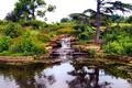
This is Gods Gardenby espenyogiComment: I don't believe the inclusion of the wood on the left adds anything to the photo. It is a lovely scene otherwise. The constrast seems to need a bit of a boost. |
| Photographer found comment helpful. |
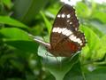
| 07/31/2003 11:11:50 AM |
Butterfly in the gardenby tucancrComment: nicely done... the focus is great, and you had such patience to get the right angle! The front of the butterfly is a bit in shadow, and I know brightening that up would cause the back (upper right) to be over exposed... but this is the only nit pick I have about the image. |
| Photographer found comment helpful. |
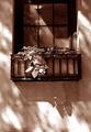
| 07/30/2003 12:57:10 AM |
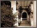
A breath of fresh air in the city...by FayechComment: I don't like how the window is cut off at the top. I think this could have been more effective using the square of the window with the rectangle.. or even square.. shape of the crop/framing of the shot. The lighting and tones are very nice. |
| Photographer found comment helpful. |
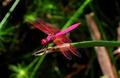
| 07/30/2003 12:44:31 AM |
Delicate crimsonby chalconeComment: very very nice! deserves a high ranking in this challenge. detail and color are amazing. his little head is a bit out of focus.. but i think that is somewhat normal for these critters.... they are so shiny, they "seem" out of focus. Great all around job! |
| Photographer found comment helpful. |
Home -
Challenges -
Community -
League -
Photos -
Cameras -
Lenses -
Learn -
Help -
Terms of Use -
Privacy -
Top ^
DPChallenge, and website content and design, Copyright © 2001-2025 Challenging Technologies, LLC.
All digital photo copyrights belong to the photographers and may not be used without permission.
Current Server Time: 08/14/2025 01:58:40 AM EDT.