| Image |
Comment |
| 08/29/2003 08:56:47 PM |
|
 Photographer found comment helpful. Photographer found comment helpful. |
| 08/29/2003 08:56:00 PM |
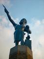
Monu-Metalby fotofrogComment: I am wanting a bit more contrast in this shot, and perhaps not so centered to make it slightly more interesting. |
| Photographer found comment helpful. |
| 08/29/2003 08:50:59 PM |
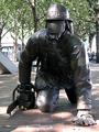
In Harm's Wayby ttreitComment: Needed to be done in depth of field mode to blur background and is a little overexposed |
| Photographer found comment helpful. |
| 08/29/2003 08:50:08 PM |
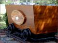
A tribute to the past.by spillerComment: Taking this shot in portrait mode would of helped to blurr the background so not distracting. It is also overexposed in few spots. |
| Photographer found comment helpful. |
| 08/29/2003 08:48:45 PM |
|
| Photographer found comment helpful. |
| 08/29/2003 08:46:40 PM |
|
| Photographer found comment helpful. |
| 08/29/2003 08:37:50 PM |
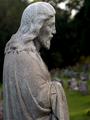
Watching O'er The Flockby alanfreedComment: good depth of field, nice stones in the statute, white parts on sky a little distracting, not too bad tho, good work |
| Photographer found comment helpful. |
| 08/29/2003 08:35:58 PM |
A Nightlight for the Seaby byetkoComment: I like this shot more on my second look than I did on my first. The lighthouse seems a bit too white, like taken in bright sun yet you have managaed to tone it down in a way that works. I like the soft feel of it, shot feels nostolgic. NOt sure about the think black border though, maybe half the size i find it distracting to your very nice image. |
| Photographer found comment helpful. |
| 08/29/2003 08:33:04 PM |
Tribute to the Cowboyby DennisFComment: HMM, i am trying to comment on all the shots, I really like the building in the background. And think I would like the shot more without the monument, but being that is the challenge, I am not sure. I guess the comp is ok, it is in focus, lighting is not bad. So mostly I think lacking 'wow' factor. good job with the tech part, keep up the good work. |
| Photographer found comment helpful. |
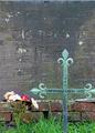
| 08/29/2003 04:19:07 PM |
Monument to Massacreby amsmythComment: Would of cropped out the top line, there is alredy enough to look at in the bottom, and top just distracts from subject. The cross is cropped too tight on the left I think. Just my opinion |
| Photographer found comment helpful. |
Home -
Challenges -
Community -
League -
Photos -
Cameras -
Lenses -
Learn -
Help -
Terms of Use -
Privacy -
Top ^
DPChallenge, and website content and design, Copyright © 2001-2025 Challenging Technologies, LLC.
All digital photo copyrights belong to the photographers and may not be used without permission.
Current Server Time: 08/05/2025 10:57:39 AM EDT.