|
|
|
Showing 661 - 670 of ~1202 |
| Image |
Comment |
| 12/22/2003 12:13:44 AM | |  Photographer found comment helpful. Photographer found comment helpful. |
| 12/22/2003 12:03:27 AM | | | Photographer found comment helpful. |
| 12/21/2003 07:05:49 PM | | | Photographer found comment helpful. |
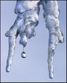
| 12/19/2003 11:22:55 AM | Just a Dropby TerryGeeComment: Greetings from the CC, a very appealing shot. Excellent focusing job, managing to get the droplet as a focus as well as the tiny bits on the icicles as sharp clear details. The over shape of the icicle is interesting, the monotone color sheme works well to unite your shot, keeping any distractions away from the viewer. My only possible criticism might be (and this is just an idea), to mirror the image putting the droplet on the right where the eye tends to go more and perhaps leaving a bit more space around the subject, especially on the left and top just to give it a little more breathing room. Overall very nicely done, as agreed upon by most folks giving you a very good score! congrats and keep up the good work. | | Photographer found comment helpful. |
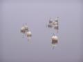
| 12/14/2003 03:22:51 PM | Winter will be here soon...by Kaja LundComment: Greetings from the CC, I love the feel of this shot, it is wonderfully composed. They are whimisically placed, yet have a feeling of intention to them. The larger number on them on the right, helps to weight your photo in that direction, making it very pleasing to the eye. The reflections are also wonderful. And despite this being 'soft focus' the sharpness still shines thru. The highlight of your shot is the foggy/silvery haze that hangs over it, giving it the feel of winter and chill. Your shot really does create a mood and a feel. I think it is a wonderfully executed shot. I am at a loss to tell you how it could be improved to be honest. The calm and emptiness add to its beauty and simplicity. Excellent work!! | | Photographer found comment helpful. |
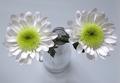
| 12/14/2003 12:04:47 PM | Simple bouquetby bormicComment: I like the white on white here, and the perspective3 by which you chose to shoot it. Well done! | | Photographer found comment helpful. |
| 12/08/2003 01:08:09 PM | | | Photographer found comment helpful. |
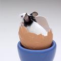
| 12/05/2003 11:27:53 AM | What's up? by sahkoComment: Greetings from the CC, obviously a loved shot and a deserved ribbon winner. I think you did very well to get the mouse to stay in that egg shell first of all. Of course it is a good shot as is, but here is my opinion what perhaps could improve it. The egg holder could possibly be black (or white) to give a more monochromatic color scheme matching the mouse or perhaps even cropped out, I find the large blue section a little distracting, then again you could try it in b&w also. The mouse could also be facing the camera, this I think would be the biggest improvement possible. Perhaps cropping a little more on the right moving the subject a bit more into that corner would make him seem like he has more room on the left to 'look into'. These are just some thoughts, to give something to think about, very nice job and congrats on the ribbon!! Well done! | | Photographer found comment helpful. |
| 12/01/2003 12:30:21 PM | Eat at Tony's, it's the best.by bruskiComment: Greetings from the CC, seems like lots of folks think this is more advertising, but I will look more at shot itself, taking 'challenge topic' considerations out. I find the shot too small for one and very busy for a small space. It feels very crammed, making my unsure of what to focus on. I think a simpler less busy compostion may have served you better. I don't find the glass in the background at all neccessary, nor the slices of bread on the right side. The garlic on the left is a little overexposed. I wonder if you would try reshoooting with less objects and see if it comes together a little better. I do like the way that the uncooked spaghetti is presented on the table, and the plate of spaghetti itself. Perhaps these, and the wine would be enough to work with.
I think your idea is good, keep playing with it, maybe next time give yourself a little more time : ).
Hope it is helpful, if not disregard and keep up the good work : )
lynn CC
p..s. if you reshoot them send them to me if you like and i will have a look. | | Photographer found comment helpful. |
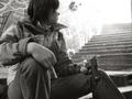
| 12/01/2003 12:20:47 PM | Why start smoking when you can take the easy way out!by DufusComment: Greetings from the CC, here is my input, if it helps great if not feel free to disregard... Your subject choice and message are both very powerful IMO, the age of your subject is poignant, the choice of b & w is very good, adding to the seriousness of the subject matter. Even your choices regarding background wall (refering to graffiti/ads, the position of subject at bottom of stairs looking up into light is very good.
My biggest objections would be I think that you could of cropped slightly more off the right, removing the (other wall?) from the top corner of shot. And while I like the brightness at top of stairs wishing there was slightly less 'brightness', it seems to draw my a little too much, taking away from the subject a little. I would like to be forced to consider the subject a little more and her 'choice' (perhaps this is not your intention).
Overall a very well done shot.
Keep up the good work
lynn CC | | Photographer found comment helpful. |
|
Showing 661 - 670 of ~1202 |
Home -
Challenges -
Community -
League -
Photos -
Cameras -
Lenses -
Learn -
Help -
Terms of Use -
Privacy -
Top ^
DPChallenge, and website content and design, Copyright © 2001-2025 Challenging Technologies, LLC.
All digital photo copyrights belong to the photographers and may not be used without permission.
Current Server Time: 08/15/2025 02:44:05 AM EDT.
|