| Image |
Comment |
| 01/09/2004 05:23:03 PM |
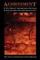
Achievementby sleekrComment: Hi and grettings from the CC. I like your funny take on this shot, and I think the poster part of this shot was well done also. I think the highlight of this shot is your master of the DOF, I like the first nail and the shadows that go with it. I think I would prefer the left top and back cropped a bit more. Although I think the composition of the nails is interesting. The lighting and colors are warm and inviting to a subject that is not that friendly creating a nice tension in your shot, helping to add to the humor of the posters overall feel.
Well done shot!
keep it up, happy shooting. |
 Photographer found comment helpful. Photographer found comment helpful. |
| 01/07/2004 11:53:35 PM |
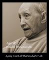
Wisdom Grows With Ageby HRoxasComment: Hi Greetings from the CC. I like this shot a lot. I think it is a beautiful portrait. I do wish that the print was all on the border. I think what i find most wonderful is that you have captured a feel in this shot, it is emotive. I think you have captured a gentleness and peacefulness in his face that is heartwarming. I think you have a great eye, often we pick subjects that do not merit a second look, this subject choice draws you in and makes you want to look again and again. I find myself longing to create a story in my mind about who this man in and the life he has led. I think this is a powerful thing to do in a photo and much more important than the technical aspects of a shot. Very nice job. keep shooting! |
| Photographer found comment helpful. |
| 01/07/2004 11:46:15 PM |
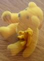
Stay Focused! (Go Bears!)by sfaliceComment: Greetings and happy new year from the CC. Well I like the idea of ghosting. I think specifically tho the table or flooring underneasth is very distracting, a solid color, probably black would of made it a bit more pleasing. I think your subject is 'cute' however I think this sort of subject has limited appeal to a certain grup of people. I think you did a good job with a somewhat blazee subject. I also think that the bear needs some room to look into in the top of the photo. Perhaps taking the tag off or editing it out may have helped as well, or position the shot so that it is hidden, just a few ideas hope they help... keep shooting! |
| Photographer found comment helpful. |
| 01/07/2004 11:36:33 PM |
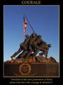
Courageby DJLubaComment: Greetings from the CC and happy new year. I think you did a good job of the poster part of this shot, the caption and border are visible yet not overbearing. I think the colour and lighting is also good, and tho generally i think a central compostion is a bit boring, i think for a poster type of shot it seems quite appropriate. I think the quote you chose provides the wow part of this image. Without it, i think,it might be a bit of a postcard.
The patriotic subject, is my only real critique of sorts. It has limited appeal, of course those with similar world views will appreciate it much more, however to the masses of people who see things differently your shot has little appeal IMO. Just something to consider. I would also like to be able to read the bottom of the monument. hope that gives you something to think about, and happy shooting! |
| Photographer found comment helpful. |
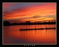
| 01/07/2004 10:23:19 PM |
Visionby bioshoreComment: HI and happy new year from CC. I like that for this topic that you went with a subtle text, allowing us to focus on the shot. The colors are vibrant. It is a sharp image. I feel like the sihloutted boats are just a little too far away and undefined, that is probably my biggest flaw IMO. These items are also heavily placed in the middle. I would like to see a bit more of the 1/3 2/3 rule encorporated, perhaps bringing the boats a bit more into the foreground. Cropping perhaps just below the reflections of the mast.
My only other thought is that the shot seems small, perhaps because of the heavier border, but it would be nice if it were sized a little bigger. Hope that helps, happy shooting! |
| Photographer found comment helpful. |
| 01/07/2004 12:08:48 AM |
|
| Photographer found comment helpful. |
| 01/06/2004 11:57:37 PM |
Wonderfully Tacky by richComment: The object in front left corner is disappointing and a distraction to an otherwise nice shot. |
| Photographer found comment helpful. |
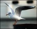
| 01/06/2004 11:55:52 PM |
Waters Edge by marboComment: Greetings and Happy New Year from the CC. Well you certainly met the challenge, and produced a good shot and got a ribbon! Congratulations! The DOF is very good, and the claws on the edge are wonderful. He is sharp and the tones in his wing are very appealing. My only suggestion may be that you give the bird a bit of room to fly into. Though it would produce an odd shaped photo. Maybe cleaning up the slight silver on the bottom may be a good idea too. Overall very nicely done, keep shooting! |
| Photographer found comment helpful. |
| 01/06/2004 11:43:08 PM |
Untitledby holyjoComment: Greetings and Happy New Year from the CC. I think as mentioned your shot needs to be in focus and maybe crop out the n, if you are trying to make a statement about 'god'. It is slightly over exposed and the reflections are a bit distracting. The composition is interesting and macros are always interesting for the details in them , however it is hard to see the detail IMO, because of the light and unfocused nature of the shot. However, I suppose it is possible these aspects are because of a statement in which case those are choices only you can make,,,IMO.... hope it helps... happy shooting! |
| Photographer found comment helpful. |
| 01/06/2004 11:32:40 PM |
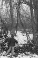
Entering the Forestby OneSweetSinComment: Hi greetings from the CC, and Happy New Year! Here's my 2 cents worth: Well the shot IMO is not stunning in subject but it does have a 'feel' to it, and in that sense I think it is a successful photo. The composition is well done, and I really like the placement of the boy on the left vs. right (as is often done). This also to me adds a creative feel and a bit of pushing out of conventional rules, and it is done in a successful and tasteful way. I also like the way the trees are towering and menacing in comparison to the tentative boy who is dwarfed in this cold forest. I think it could use a little more contrast and perhaps a bit of sharpening but I do quite like what you have done here! well done and keep shooting!! |
| Photographer found comment helpful. |
Home -
Challenges -
Community -
League -
Photos -
Cameras -
Lenses -
Learn -
Help -
Terms of Use -
Privacy -
Top ^
DPChallenge, and website content and design, Copyright © 2001-2025 Challenging Technologies, LLC.
All digital photo copyrights belong to the photographers and may not be used without permission.
Current Server Time: 08/14/2025 11:57:24 AM EDT.