| Image |
Comment |
| 07/11/2007 04:38:40 PM |
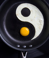
Eggregation by scalvertComment: Wonderful. Had me in stitches - and that was before I saw the title! I can only say how highly jealous I am of your wit and creativity. |
 Photographer found comment helpful. Photographer found comment helpful. |
| 07/11/2007 04:37:12 PM |
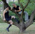
Good Girl / Bad Girlby KelliComment: A good concept imaginatively shot. Seriously over-sharpened however! The colours are washed out as a result of your camera (a trip though PS or equivalent could make a difference but not enough of one) and I think that a greater focus on their expressions in a simpler setting might have proved more effective. |
| Photographer found comment helpful. |
| 07/11/2007 04:35:36 PM |
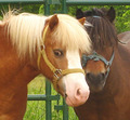
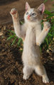
Brothers - angelic and devilish!by snafflesComment: You're right - the one on the left looks stupidly angelic, and there is definitely something a bit Hannibal Lecter about the other. Unfortunately, and I'm sure you don't need me to tell you this, the quality of the image is too low and the colours too washed out for this shot to do well. |
| Photographer found comment helpful. |
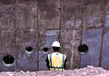
| 07/11/2007 04:33:58 PM |
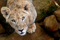
Hunter / Huntedby rosiehallComment: It's always great to have shots like this where you feel the creature making eye contact with you. Composition-wise, having the subject off-centre is a great choice, but your background doesn't do you any favours - it is too close for you to play with DOF so we're just left with some out-of-focus brown rocks which for me are a bit of a distraction; not that you had any power over this. Looks like we have a bit a purple fringing in vital areas which is a pity. But none of this detracts from the fact that you clearly have the eye for a very striking shot. |
| Photographer found comment helpful. |
| 07/11/2007 04:21:26 PM |
Between Thought and Actionby elizadebComment: I like the composition here very much. However you have a big problem with noise artifacts, probably as a result of a less than ideal jpeg conversion, or even just a sub-standard camera. I don't think this addresses the idea of dichotomy as much it could. |
| Photographer found comment helpful. |
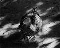
| 07/11/2007 04:18:45 PM |
The Contrast of Natureby RulerZigzagComment: Nicely converted but the lighting is not ideal - if the duck's face had been brought out more it would have made a big difference I think. The lighting conditions were obviously very harsh and I think you have done well out of that situation. Unfortunately whilst contrast is shown, the concept of dichotomy is unexplored and the score will suffer as a result. |
| Photographer found comment helpful. |
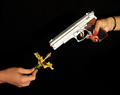
| 07/11/2007 04:10:30 PM |
War and peaceby Rino63Comment: A bold idea which works very well. I might have gone for a different flower - a white one would symbolise peace a little better, but I don't suppose you had much choice. I very much like the contrast between the hands as well as what they're holding. |
| Photographer found comment helpful. |
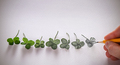
| 07/08/2007 04:59:59 AM |
Luck of the Draw by scalvertComment: Superb. Captures both sides of the challenge and is startlingly original at the same time. My pick for the blue. |
| Photographer found comment helpful. |
| 07/03/2007 02:24:42 PM |
|
| Photographer found comment helpful. |
| 07/03/2007 07:22:41 AM |
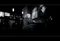
purgatoryby bucketComment: I remember seeing this shot a while ago and I couldn't believe I didn't add it to my favourites. Since then I've been trawling through the black and white gallery in a vain attempt to find it. Now incredibly I've just stumbled across it in the forums. It really is the most wonderful photo and one you should be very proud of. |
| Photographer found comment helpful. |
Home -
Challenges -
Community -
League -
Photos -
Cameras -
Lenses -
Learn -
Help -
Terms of Use -
Privacy -
Top ^
DPChallenge, and website content and design, Copyright © 2001-2025 Challenging Technologies, LLC.
All digital photo copyrights belong to the photographers and may not be used without permission.
Current Server Time: 08/23/2025 05:33:36 PM EDT.