| Image |
Comment |
| 06/15/2006 02:28:58 AM |
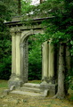
Door frame framedby SimpaComment: Mackenzie King Estate. Great location though I feel the image needs to be a bit brighter. Must have been an overcast day. |
 Photographer found comment helpful. Photographer found comment helpful. |
| 06/06/2006 08:17:36 AM |
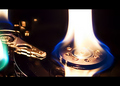
Hard Drive Failureby freakin_hilariousComment: ** Critique Club **
Composition: Placement of the flame works well and the arm of the hard drive works as a leading line to the flame. However, the bright spots on the left are a bit of a distraction and leads the viewer out of the image.
Cropping the bright spots on the left could possibly improve the image.
Exposure: Flames are hard to get the exposure right for. In this case, most of the flame is blown out though does not detract from the image. The flame seems to provide enough light to bring out detail in the shadows. Some areas of the arm (small) appear blown out but are not a distraction.
Impact: Some impact is achieved through the use of unusual lighting (the flame).
Processing: Good choice of border. The sharpness of the main subject under the flame is good, however the drive arm appears oversharpened.
Overall, interesting image.
Colette |
| Photographer found comment helpful. |
| 06/02/2006 02:38:07 AM |
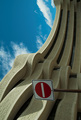
No entry- God's Playgroundby smykComment: The Museum of Civilization is always a good choice for architecture due to it's uniqueness. Interesting angle you chose. |
| Photographer found comment helpful. |
| 05/31/2006 09:10:12 PM |
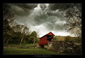
Stormy Weatherby deapeeComment: I like the contrast between the bridge and the sky. The clouds really set the mood. |
| Photographer found comment helpful. |
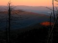
| 05/28/2006 11:08:37 PM |
sunrise mnt tipsby igoofryComment: Love the layered effect of the mountains. The burnt out trees nicely frame the scene. |
| Photographer found comment helpful. |
| 05/28/2006 11:55:33 AM |
|
| Photographer found comment helpful. |
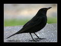
| 05/21/2006 04:22:10 PM |
blackbirdby mortyComment: Your composition takes advantage of the diagonal space and the exposure brings out the detail of the birds feathers without blowing out the highlights. |
| Photographer found comment helpful. |
| 05/05/2006 11:01:38 PM |
Four Years Laterby KonadorComment: Great focus on the eye and detail in the hair. I really like the falloff from light to dark on the right. The light and dark areas are balance very well.
However there seems to be a hot spont on the cheek. |
| Photographer found comment helpful. |
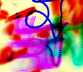
| 05/03/2006 07:47:35 AM |
Painting with darkby arhunt35Comment: Without the blue line I think it would make a fine abstract, though maybe a bit cluttered. The blue line doesn't seem to serve any purpose since the texture and opaqueness (?) of the colour don't seem to harmonize with the rest of the image. |
| Photographer found comment helpful. |
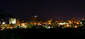
| 05/02/2006 08:08:19 PM |
Small Cityby karmatComment: The colours in the lit area are nice and none seem blown (except maybe the one on the far left), however the horizon is tilted. |
| Photographer found comment helpful. |
Home -
Challenges -
Community -
League -
Photos -
Cameras -
Lenses -
Learn -
Help -
Terms of Use -
Privacy -
Top ^
DPChallenge, and website content and design, Copyright © 2001-2025 Challenging Technologies, LLC.
All digital photo copyrights belong to the photographers and may not be used without permission.
Current Server Time: 08/17/2025 01:09:38 AM EDT.