| Image |
Comment |
| 07/10/2008 10:30:06 AM |
|
 Photographer found comment helpful. Photographer found comment helpful. |
| 07/07/2008 09:59:54 AM |
Texas Summerby JutildaComment: The texture adds some wonderful character to this image. Makes it look like a painting. |
| Photographer found comment helpful. |
| 06/23/2008 11:44:44 PM |
|
| Photographer found comment helpful. |
| 06/23/2008 11:38:21 PM |
S I S T E R Sby bnileshComment: Good placement and symmetry of your subjects. I think the image needs a bit more contrast though. |
| Photographer found comment helpful. |
| 06/08/2008 12:59:57 PM |
|
| Photographer found comment helpful. |
| 05/06/2008 10:49:10 AM |
Springby tinky2Comment: Very imposing. Wonderful colour and bokeh. |
| Photographer found comment helpful. |
| 05/03/2008 07:22:37 PM |
|
| Photographer found comment helpful. |
| 05/03/2008 07:21:57 PM |
|
| Photographer found comment helpful. |
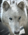
| 05/01/2008 09:58:00 AM |
white wolf by heavyjComment: The exposure on the face seems ok but there are some blown areas at the top of the image.
I suspect the crop was to get rid of as much of that as possible.
The nose seems to be a bit more in focus than the eyes. An increase in DOF would probably help with that. |
| Photographer found comment helpful. |
| 04/11/2008 08:09:00 PM |
Upward Curveby freudoComment: *** Critique Club ***
First impressions: There's a sense of strength here. The diagonal placement of the main subject helps with that.
Composition: Choice of angle for this shot I think works very well. It might even be improved if the main subject were placed at a steeper diagonal.
Exposure: For the most part the exposure seems pretty good though there is a bright spot in the lower left which draws the eye away from more interesting areas of the image.
Impact: I think the impact is drawn from the repeating patterns and use of the diagonal.
Keep shooting.
Cheers!
Colette |
| Photographer found comment helpful. |
Home -
Challenges -
Community -
League -
Photos -
Cameras -
Lenses -
Learn -
Help -
Terms of Use -
Privacy -
Top ^
DPChallenge, and website content and design, Copyright © 2001-2025 Challenging Technologies, LLC.
All digital photo copyrights belong to the photographers and may not be used without permission.
Current Server Time: 08/07/2025 12:58:04 AM EDT.