| Image |
Comment |
| 08/01/2003 06:17:34 PM |
Camouflageby LindaEComment: Your title says it all. It's hard to tell his front end from his back end. Though it seems a little dark on the right the lighting on the left is good. A reflector or a flashlight may help in these situations to balance the lighting.. |
 Photographer found comment helpful. Photographer found comment helpful. |
| 07/31/2003 08:50:25 PM |
National Theatre of Hungaryby csokaComment: You've handled the exposure well here and your composition for the most part is good with the curved line leading the viewer to the background with the interestingly shaped trees. The concrete pillar on the left is distracting. The image would still be balanced without it. |
| Photographer found comment helpful. |
| 07/31/2003 08:47:10 PM |
Untitledby johnnykillchristComment: This is a great idea. Nice use of diagonal lines and you've captured a lot of texture in the hose. A levels adjustment may have helped with the deep shadows or the use of a reflector or side light when taking the photo. |
| Photographer found comment helpful. |
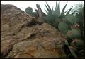
| 07/31/2003 08:10:24 PM |
"Morning In My Garden"by tfarrell23Comment: You've done the right thing here to try and eliminate as much of the bright white featureless sky as possible though it still had an influence on your camera's light meter causing the main subjects, rock and cactus, to be under exposed. One way to resolve this would be to take a meter reading off the rock only (either with spot metering or by filling the frame with the rock) then locking the exposure and recomposing to what you want in the frame. |
| Photographer found comment helpful. |
| 07/31/2003 07:50:33 PM |
wheel barrel in the gardenby lucillebComment: The basic construction of this image is well done. i.e. the leading line of the fence brings the viewer right to the bright red wheelbarrow. The line of the porch keeps the viewer from going past the wheelbarrow into the shadows.
Since the lines lead the viewer to the wb it could probably benefit from better focus and the exposure could be a little more. Where the image is focused is white which fooled your camera's light meter into underexposure. - 5 |
| Photographer found comment helpful. |
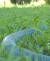
| 07/31/2003 07:31:53 PM |
Hose Constrictorby deadbrainComment: Nice idea. The bright area at the top is distracting. Cropping it out and taking this from a lower perspective could possibly add impact. |
| Photographer found comment helpful. |
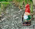
| 07/31/2003 07:30:05 PM |
Lost in the Ma(i)zeby natorComment: The light falling between the corn stalks is interesting along with the pattern in the parched ground. Impact could possibly be improved by increasing the contrast between the shafts of light and the dirt.
The gnome is a cute touch but I don't think was necessary. Did you try this vertically and/or without the gnome? |
| Photographer found comment helpful. |
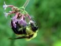
| 07/31/2003 07:17:24 PM |
Butterflyby Boobra40Comment: Your choice of diagonal presentation works here. You probably could have gone a bit more. With respect to lighting the bottom part of the image is a little dark. This is probably due to the brightness at the top of your image. Use of a reflector could possible solve this. |
| Photographer found comment helpful. |
| 07/31/2003 07:01:18 PM |
Drink it Downby banmornComment: Nice composition though it seems a little soft on the focus. Also, use of a reflector above the flower may of helped to get more light on your subject. |
| Photographer found comment helpful. |
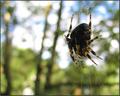
| 07/31/2003 05:53:04 PM |
Spider in the gardenby siggithorComment: I like the sparkles of light in the background and the vertical lines but they distract from your main subject. Less DOF would make the spider more prominent and your background less distracting.
If the spider wasn't there then I would suggest just a little more DOF but keep the entire image out of focus. In that regard it makes me think of Monet. |
| Photographer found comment helpful. |
Home -
Challenges -
Community -
League -
Photos -
Cameras -
Lenses -
Learn -
Help -
Terms of Use -
Privacy -
Top ^
DPChallenge, and website content and design, Copyright © 2001-2025 Challenging Technologies, LLC.
All digital photo copyrights belong to the photographers and may not be used without permission.
Current Server Time: 08/05/2025 04:46:16 PM EDT.