| Image |
Comment |
| 10/02/2004 01:04:07 PM |
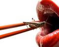
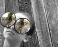
Come Closerby jab119Comment: Lighting - subject is well lit in the right spots
Colour - good contrast between the main subject and the background, wonderful palette of green for the background.
Composition - good placement , draws the viewer to the main focal point - maybe just a little too tight a crop on the right. Good use of depth of field,
Exposure - There seems to be some bright spots on the head and around the eye - 1/3 of a stop (or even less) less exposure would probably tone this down a bit
Focus seems to be a bit soft. 8 |
 Photographer found comment helpful. Photographer found comment helpful. |
| 10/02/2004 01:03:06 PM |
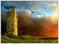
Sunset at Castle Hill by BobsterLobsterComment: Lighting - highlights the tower perfectly - my guess is early am - very nice gold glow
Colour - The palette is perfect - all colours complement each other and are natural looking
Exposure - good detail in the tower while avoiding any blown out areas in the sky
Composition - good placement of the tower and low perspective - different angles may have shown more of the landscape (if there is more to show)
10 |
| Photographer found comment helpful. |
| 09/30/2004 06:55:27 PM |
|
| Photographer found comment helpful. |
| 09/29/2004 07:18:57 PM |
|
| Photographer found comment helpful. |
| 09/29/2004 07:14:37 PM |
Those Wacky Icelandersby ArnarpComment: With composition, simpler is usually better. You have a good idea here, however, I think it's a little too cluttered. Also, the white balance seems a bit off. |
| Photographer found comment helpful. |
| 09/29/2004 07:09:36 PM |
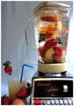
Goldfish Smoothieby afarlandComment: This is funny. The expression on the fishies face is priceless.
The crop seems a little too tight top and bottom and I think a little more light on the left maybe through the use of a reflector would do wonders. 5 |
| Photographer found comment helpful. |
| 09/29/2004 06:46:47 PM |
Full Flushby ArtanComment: The white flower set against the red background make it stand out quite well, however I think if there was more light you could bring out more detail in the petals. The curve of the stem adds softness to the image.
Also, if the hand was intentional then a little less pressure with the thumb would add to the softness (IMO). |
| Photographer found comment helpful. |
| 09/24/2004 08:43:05 AM |
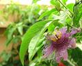
The Passion of the Flowerby jjenksComment: This flower has some interesting patterns and textures. Good find.
I think it would make a good macro study. Get up close and personal with it. Moving in closer will also help eliminate anything that is distracting in the background. In this image what I find distracting is the central leaf that is in focus. |
| Photographer found comment helpful. |
| 09/20/2004 12:11:53 PM |
Windows to the Soul by ColeyComment: Very cool idea and the selective desat works very well. The cropping is just a little too tight on the left. |
| Photographer found comment helpful. |
| 09/12/2004 05:17:11 PM |
DSCF0086s.jpgby siggiComment: I very much like the pose, composition here. One thing though, her fingers are cut off. I think it would be better to show her entire hand. |
| Photographer found comment helpful. |
Home -
Challenges -
Community -
League -
Photos -
Cameras -
Lenses -
Learn -
Help -
Terms of Use -
Privacy -
Top ^
DPChallenge, and website content and design, Copyright © 2001-2025 Challenging Technologies, LLC.
All digital photo copyrights belong to the photographers and may not be used without permission.
Current Server Time: 08/07/2025 12:57:55 AM EDT.