| Image |
Comment |
| 07/16/2008 09:10:50 AM |
|
 Photographer found comment helpful. Photographer found comment helpful. |
| 07/16/2008 09:09:57 AM |
|
| Photographer found comment helpful. |
| 07/08/2008 07:26:46 AM |
|
| Photographer found comment helpful. |
| 07/01/2008 08:26:26 AM |
|
| Photographer found comment helpful. |
| 05/14/2008 08:27:20 AM |
OUCH!!!by MiepComment: Amazing how many people didn't see that it was rotated. Kudos to you for fooling so many people. |
| Photographer found comment helpful. |
| 04/14/2008 08:59:43 AM |
|
| Photographer found comment helpful. |
| 04/14/2008 08:51:49 AM |
|
| Photographer found comment helpful. |
| 04/08/2008 09:31:38 AM |
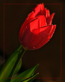
Morning Glowby gwe21Comment: The inside border doesn't really go over well here on DPC. having it clip the flower on the top doesn't help either. The way the background flower falls directly behind the one in the foreground, with the same lighting on them, the almost blend together, really taking away from what is a beautiful single flower. |
| Photographer found comment helpful. |
| 04/08/2008 09:27:17 AM |
Remembranceby breadfan35Comment: I do like the shallow DOF, putting the focus where it should be. The angle works, but I'm not a fan of the crop. I would like to see the entire square that belongs to the subject, and the corner on right side of the photo, IMO, needs to be gone. |
| Photographer found comment helpful. |
| 04/08/2008 09:16:27 AM |
Dying of Thirst!by Dirt_DiverComment: Gradient background is a great setup, but like others have said, looks blown out at the base. I think the curved glasses could have been better set up symetricaly with the gradient. (they aren't centered) Looks like some air bubbles sticking to the side of the glass filled with water? a little distracting. The dead rose is to dark, and neither of their leaves have much color in them. Thats my opinion. |
| Photographer found comment helpful. |
Home -
Challenges -
Community -
League -
Photos -
Cameras -
Lenses -
Learn -
Help -
Terms of Use -
Privacy -
Top ^
DPChallenge, and website content and design, Copyright © 2001-2026 Challenging Technologies, LLC.
All digital photo copyrights belong to the photographers and may not be used without permission.
Current Server Time: 07/15/2026 07:55:45 PM EDT.