| Image |
Comment |
| 04/26/2007 10:08:27 PM |
|
 Photographer found comment helpful. Photographer found comment helpful. |
| 04/26/2007 10:06:20 PM |
|
| Photographer found comment helpful. |
| 04/22/2007 03:44:48 PM |
Crib Coiffeby OmanOtterComment: I'm not big on baby snapshots here at DPC, but this one is a classic! What an excellent face! |
| Photographer found comment helpful. |
| 04/22/2007 03:43:22 PM |
He's Jaaaack!by tateComment: I like the idea, but the postprocessing of the eyes makes them look very unnatural |
| Photographer found comment helpful. |
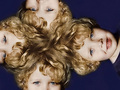
| 04/21/2007 11:46:59 PM |
Tiffany's Hairby EvetsStneerComment: Beautiful model with excellent hair, but the background is distracting and her hair blends in too well with it. Also, why such a small image? |
| Photographer found comment helpful. |
| 04/21/2007 11:39:40 PM |
A DARK PAST by eliteComment: Very well done! The subtle color in the iris is just right. I find the outline of the contact lens a bit distracting though, I would have edited that out. |
| Photographer found comment helpful. |
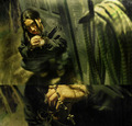
| 04/21/2007 11:36:57 PM |
devotionby arsenalComment: Highly original, and there's a lot to like here. The stark lighting, green color-cast, high angle, and crouching model all work very well together to create a disturbed/troubled feel. But I don't get the ropes in the foreground. They attract significant attention, but don't really say anything to me. Also, the accidental alignment of the head in the lower panel and the shadow in the upper panel is distracting (would have been less distracting in a separated diptych). But all in all, impressive work! |
| Photographer found comment helpful. |
| 04/01/2007 11:59:10 PM |
Poisedby elsapoComment: Her skin looks a little too smoothed (neatimage/noise-ninja?), but otherwise this is excellent work. I particularly like how all the colors seem to fall into one of two hues, the brown of her skin, eyes, and hair, and the blue of her eyeliner and earrings. |
| Photographer found comment helpful. |
| 04/01/2007 11:53:32 PM |
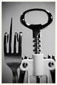
Postman's Knockby kevrobertsonComment: Good idea and well set up, but the bright white halo around his hat is far too distracting. Also the super-high contrast is not my taste. |
| Photographer found comment helpful. |
| 04/01/2007 11:48:07 PM |
Waitingby jsc9306Comment: The jagged outline of the statue is too obvious (you need to feather the selection boundary), also the background looks suspiciously clean compared to the very noisy statue. |
| Photographer found comment helpful. |
Home -
Challenges -
Community -
League -
Photos -
Cameras -
Lenses -
Learn -
Help -
Terms of Use -
Privacy -
Top ^
DPChallenge, and website content and design, Copyright © 2001-2025 Challenging Technologies, LLC.
All digital photo copyrights belong to the photographers and may not be used without permission.
Current Server Time: 08/04/2025 06:00:08 PM EDT.