|
|
| Image |
Comment |
| 12/19/2002 09:39:05 PM | Shaken, not stirred... by AleciaComment: I don't know if you make them or drink them - but I do know this is the best photo here. Print it and frame it - a 10.
Jim msp |  Photographer found comment helpful. Photographer found comment helpful. |
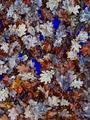
| 12/19/2002 09:40:22 AM | Empty pool autumn bluesby jjbeguinComment: Critique Club Critique
(1) COMPOSITION (CONTENT) - At first appearance, seems very busy. My eye tends to wander around quite a bit. I seem to be looking for your subject. It’s not until later that I realize the whole canvas is your subject, at least to me. I don’t like the two horizontal lines across the picture, though they are mostly covered; a minor distraction.
(2) BACKGROUND – See comment above. I’m not sure what is the background is, and what the main subject is. It’s hard for me to call the leaves the background
(3) CAMERA WORK ,TECHNICAL – Very good for what you intended. Focus is dead on.
(4) DIGITAL PROCESSING ,TECHNICAL – At first glance, it appears you over saturated the blues. The material under the leaves is too blue for my tastes (I know the challenge is “blue”). But you probably needed to do that to get the blue in the leaves.
(5) MY OPINION ON THE PHOTO – Overall, pretty good, an “artsy” photo, tending to the abstract. I like it. I think it could have been a much better abstract if you had played with the focus some, shooting the leaves well out of focus. Then the over saturated blues would have worked better. It may not have scored better, as the majority of voters here don’t appreciate abstract photos, but I think you may have been happier with it.
Jim msp
| | Photographer found comment helpful. |
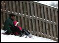
| 12/18/2002 02:12:38 PM | First Snowby BAMartinComment: Critique Club Critique
(1) COMPOSITION (CONTENT) – Well composed. I like the position of the sledders in the photo, giving a nice sense of motion from left to right. The diagonal elements really makes the picture – the fence, the tilted fence slats, and the bend of the legs. The one bright coat really draws the eyes.
(2) BACKGROUND – I like the “dull fence”, the white snow, and even the dark coat of the adult rider.
(3) CAMERA WORK ,TECHNICAL – Looks good to me; everything looks in focus. The fast shutter speed captured the snow flakes well.
(4) DIGITAL PROCESSING ,TECHNICAL – No changes I can see. Your exposure and post processing got the snow “just right”.
(5) MY OPINION ON THE PHOTO – A very good winter picture. You probably suffered in the voting because of the “snapshot” reaction of some of the voters (just a child on a sled). But I don’t believe they really looked past the child at the total composition. For the majority of the voters, you might have also tried a slower shutter speed (and smaller aperture) to get a little blurring of the riders & sled. This would have required some trial and error, I’m sure. You could have also tried some motion blur by moving the camera left to right with the sled. Each would have produced a different “look and feel” to the end result.
Jim msp
| | Photographer found comment helpful. |
| 12/16/2002 11:46:03 PM | Grinding Showerby CubComment: Critique Club Critique
(1) COMPOSITION (CONTENT) – Very well composed. I like the very well defined diagonal. Clearly shows the sparks in motion.
(2) BACKGROUND – The only defect I see is the bright reflection just right of center. Did you have any control of this? The dark area on the right works very well.
(3) CAMERA WORK ,TECHNICAL – Very good I like the chosen DOF which just slightly blurs the background. I don’t think more would have hurt.
(4) DIGITAL PROCESSING ,TECHNICAL – No recommended changes
(5) MY OPINION ON THE PHOTO – A very good photo. You deserve the high finish. BTW, I did a flip of this by 180 deg in PS . It makes the sparks radiate upward, changing the effect somewhat. That angle would have worked better, imho, if you could have somehow darkened the background.
Jim msp
| | Photographer found comment helpful. |
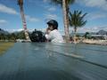
| 12/09/2002 10:54:52 PM | Nanakuli Blueby CubComment: Critique Club Critique
(1) COMPOSITION (CONTENT) - In my opinion, too dominated by the table, since I think you wanted the blue sky here. On the other hand, the wires, poles, and buildings on the far right detract. It would have been interesting if you had rotated to the right more, trying slightly different alignments. Having her off center slightly would probably help.
(2) BACKGROUND – See above. The right hand area should be cropped out.
(3) CAMERA WORK ,TECHNICAL – Good focus & DOF
(4) DIGITAL PROCESSING ,TECHNICAL – I think a crop along the nearer tree on the right, and above the shadow on the table would make a great difference to this. Try a more portrait look.
(5) MY OPINION ON THE PHOTO – I think I get the feeling you were after here – but a different cropping might have helped immensely, turning something above a snapshot into more of a photograph.
Jim msp
| | Photographer found comment helpful. |
| 12/05/2002 10:12:45 PM | Blueberry Splash by JackoComment: Supurb catch. Excellent composition, and technically well done. 9
Jim msp | | Photographer found comment helpful. |
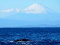
| 12/05/2002 10:08:30 PM | Simply Blueby NatashaComment: Well done. Nice choice of angle for this one ( I am assuming Mt Fuji).Technically well done. 9
Jim msp | | Photographer found comment helpful. |
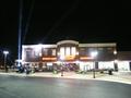
| 11/26/2002 10:47:00 PM | Grand Openingby ClubJuggleComment: Good idea. I think it should have been cropped a little more, though. And you should have slid right a little so the street light did not obscure the name of the place. Jim msp | | Photographer found comment helpful. |
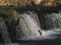
| 11/29/2002 08:09:00 PM | November Spawnby kandyjComment: Well done. It would be fun to see a closer crop to emphasize the fish a tad more. Score - 8 Jim msp | | Photographer found comment helpful. |
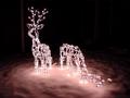
| 12/02/2002 08:53:00 PM | Christmas Season is Upon Us ( small town news)by SonifoComment: (1) COMPOSITION (CONTENT) - Good idea to include two lighted reindeer. I just don’t like the position of the one on the right – nose is buried. But I also like the apparent lack of new footprints in the snow. (2) BACKGROUND – The “pole” on the left is quite distracting; especially since the one reindeer seems to be looking at it. Could you have rotated a bit to your left? The snow fall on top of old prints (?) give the ground some texture, which is really nice. (3) CAMERA WORK ,TECHNICAL – Quite good. The exposure is right on, as is the focus. Perhaps a smaller DOF would have helped hide the background. (4) DIGITAL PROCESSING ,TECHNICAL – Very good. You have the snow white, not gray. (5) MY OPINION ON THE PHOTO – When I first looked at this photo, I had two different reactions. First, I liked the reindeer on the left, but not the one on the right. Second, I like the lighting and overall exposure. – a crisp winter night. Overall, well better than average. Jim msp Critique Club | | Photographer found comment helpful. |
Home -
Challenges -
Community -
League -
Photos -
Cameras -
Lenses -
Learn -
Help -
Terms of Use -
Privacy -
Top ^
DPChallenge, and website content and design, Copyright © 2001-2025 Challenging Technologies, LLC.
All digital photo copyrights belong to the photographers and may not be used without permission.
Current Server Time: 08/19/2025 09:57:44 PM EDT.
|