| Image |
Comment |
| 01/29/2009 04:16:33 AM |
|
 Photographer found comment helpful. Photographer found comment helpful. |
| 01/29/2009 04:16:04 AM |
|
| Photographer found comment helpful. |
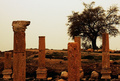
| 01/29/2009 04:15:18 AM |
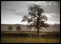
The Witness of a fallen Empireby ahmadbaaraComment: I like the idea of balancing columns with tree. Colors are a little wierd to me, but almost work too. The tree itself seems a little too far right and not a big enough focus for the shot. Just humble opinion... |
| Photographer found comment helpful. |
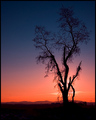
| 01/29/2009 04:13:58 AM |
Sunset Dramaby KelliComment: The colors are very nice. I wish you had cropped a bit off the right (the sky is pretty, but the rest is pretty dark and doesn't add much.) A square compostion might have looked a little nicer. |
| Photographer found comment helpful. |
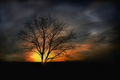
| 01/29/2009 04:12:45 AM |
Last Lightby SaraRComment: I like the colors and exposure in this. One of the few I've seen that has more than one tree but still seems to fit the 'single' tree part. Nice shot. |
| Photographer found comment helpful. |
| 01/29/2009 04:12:02 AM |
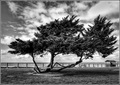
The Viewby ScapeshotsComment: I like the B&W and contrast. The hut provides a nice little detail. Nice that '3' trees is really one. |
| Photographer found comment helpful. |
| 01/29/2009 04:10:53 AM |
Divisionby mpetersComment: The colors are nice in this, but the tree seems like it may not capture enough of the focus. |
| Photographer found comment helpful. |
| 01/29/2009 04:09:54 AM |
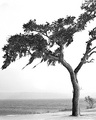
Winter Treeby sabphotoComment: Like this one, but maybe not quite enough detail in the leaves/branches. And to get nitpicky, the horizon is a little tilted. Nice shot though |
| Photographer found comment helpful. |
| 01/29/2009 04:08:46 AM |
Little Treeby okkyComment: This one doesn't seem quite 'single' enough. Colors look a little blown out. |
| Photographer found comment helpful. |
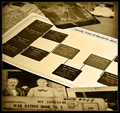
| 09/03/2003 02:34:11 PM |
Shucksby johnmComment: A little blurry and the line across the screen is distracting. I like the idea though. |
| Photographer found comment helpful. |
Home -
Challenges -
Community -
League -
Photos -
Cameras -
Lenses -
Learn -
Help -
Terms of Use -
Privacy -
Top ^
DPChallenge, and website content and design, Copyright © 2001-2025 Challenging Technologies, LLC.
All digital photo copyrights belong to the photographers and may not be used without permission.
Current Server Time: 08/01/2025 09:31:12 PM EDT.