| Image |
Comment |
| 07/11/2004 03:33:55 PM |
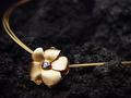
Eleganceby willemComment: Very nice. I think the background is lava rock but I could be way off. I like that idea of the extremes in textures (yet gold comes from a rock of sorts so it is a fitting kind of background). But it isn't quite clear from this photo. It might just be a black towel, which I don't like. There could be a teeny bit more light on the lower petal to the immediate left of the frame. The shadow is good for developing the form but it is bit too dark and actually cuts off some of the form. |
 Photographer found comment helpful. Photographer found comment helpful. |
| 07/11/2004 03:30:47 PM |
|
| Photographer found comment helpful. |
| 07/11/2004 03:29:42 PM |
La Carrera Sports: Don't Stop The Raceby GordonComment: Very good. The labeling on his clothes should be a bit more in focus but I can see how this would be difficult. If it were a real add, the print would avoid any confusion for the viewer but it still wouldn't be perfect. Someone who doesn't know much about the sport (like myself) can not immediately identify what the product is. It could be the bike itself, the brakes, the tires, the helmet, or the clothing.
Still, that is a just a minor nit. This one is quite good. |
| Photographer found comment helpful. |
| 07/11/2004 03:26:37 PM |
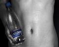
Best for Your Body by sahkoComment: Very nice. The selective desaturation actually works (I usually don't like this technique) and the body is healthy looking and attractive. The only beef I have is that at first it is hard to tell the gender of the model at first glance. I thought it was a woman because of the rounded belly. Then I noticed the ribcage was too heavy for a woman. After that, I saw the hands and the belly button hair and figured it out for sure. I think next time, unless the male model is really cut and defined, you should have him (or yourself) suck in for the shot. I'm pretty sure you aren't allowed in Open Challenges but if this had been a member challenge I would have also suggested cloning out the freckles.
Still, one of the best I've seen so far. It shows the product prominently; it isn't overwhelmed by the model. It's a good composition and it is very clear to the veiwer what is being advertised. The somewhat androgynous quality of the figure actually could be a help, when one thinks abou it. |
| Photographer found comment helpful. |
| 07/11/2004 03:20:45 PM |
|
| Photographer found comment helpful. |
| 07/11/2004 03:16:21 PM |
|
| Photographer found comment helpful. |
| 07/11/2004 03:12:26 PM |
|
| Photographer found comment helpful. |
| 07/11/2004 03:11:10 PM |
Best Productby graphicfunkComment: Funny idea. I'm not sure about the bacgkround and the surface the product is sitting on. It looks rather haphazard and not as well thought out as the labeling. The background, although blurry, still looks a bit complicated and distracting. I keep trying to figure out what the object at the top of the frame is. The surface appears to be some sort of old metal case or box. I shouldn't be wondering about this kind of thing. The crop is a bit too severe at the right and there seems to be a slight tilt. |
| Photographer found comment helpful. |
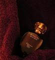
| 07/11/2004 03:08:12 PM |
Dangerous Seductionby airaticComment: A bit small to get a good feel for the image quality. The label is easily red so it looks like your focus is pretty good. I like the color, lighting and composition. I'm not sure about the background which appears to be either a towel or fleece blanket. Velvet would have worked much nicer. I just wish it were a bit bigger. |
| Photographer found comment helpful. |
| 07/11/2004 03:06:38 PM |
All Naturalby briphotoComment: A little dark at the edges but overall very nice. Good composition, product display, color, mood. Very nice effort! |
| Photographer found comment helpful. |
Home -
Challenges -
Community -
League -
Photos -
Cameras -
Lenses -
Learn -
Help -
Terms of Use -
Privacy -
Top ^
DPChallenge, and website content and design, Copyright © 2001-2025 Challenging Technologies, LLC.
All digital photo copyrights belong to the photographers and may not be used without permission.
Current Server Time: 08/27/2025 02:38:03 AM EDT.