| Image |
Comment |
| 08/18/2004 11:29:16 PM |
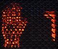
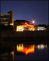
Animal Glueby bobgaitherComment: Sorry, I just can't figure out what this is. I don't really see the color as a neon color. The composition doesn't make much sense to me. |
 Photographer found comment helpful. Photographer found comment helpful. |
| 08/18/2004 02:15:45 PM |
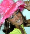
Cowgirl Baby!by cassilda_terryComment: The model needs to be placed further from the background. When the model is shot so close to a background, the composition has a very claustrophobic, compressed feeling. It's a nice pose and the cropping is good but the lighting appears harsh and unflattering. I like her hat but it isn't a cowboy hat so the title is a bit confusing. Also, she is pulling at some pink lining (or something) from the inside of the hat and that is extremely distracting. |
| Photographer found comment helpful. |
| 08/18/2004 02:10:44 PM |
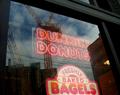
Building a better Donutby BKerrComment: Somehow, the sight of the sign for 'Freshly Baked Bagels" is jarring after reading the title of the photo. It's a fun concept but I don't think the execution works too well. |
| Photographer found comment helpful. |
| 08/18/2004 02:08:04 PM |
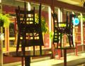
Afterhoursby rightmiremComment: While there is some neon in this composition, the focal point seems to be more about the arrangement of the chairs and the mood of closing time. The neon clock in the corner is just a small detail that actually distracts the eye in a negative way from the main composition. |
| Photographer found comment helpful. |
| 08/18/2004 02:04:23 PM |
|
| Photographer found comment helpful. |
| 08/18/2004 02:02:41 PM |
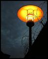
Separeted Worldsby MonaComment: This is a very good shot. I like the sharp angle of the wall, and the barbwire against the moody sky. The yellow glow of the lamp is also very striking. Unfortunately, I'm not really getting a feel of neon from the lamp light--it has more of a warm incandescent quality to it. |
| Photographer found comment helpful. |
| 08/18/2004 02:00:03 PM |
Neon...by gorkeComment: The color appears very drab to me. Almost white with only a bit of blue at the top of the letters. |
| Photographer found comment helpful. |
| 08/18/2004 01:59:21 PM |
After Hours: Hustle & Bustleby dhareComment: I like street photography but there should be something to capture my attention and this shot is lacking that something. The only thing that really captured my attention is the "Hungry Jacks" logo appears to be borrowing heavily from Burger King. |
| Photographer found comment helpful. |
| 08/18/2004 01:54:25 PM |
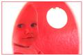
Neon Gracieby parrotheadComment: Very interesting portrait. The color is appropriate for the child. I'd like to see a little more brightness in her face. |
| Photographer found comment helpful. |
| 08/18/2004 01:53:19 PM |
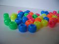
Neon Ponybeadsby neatizzyComment: This is a fun subject but the lighting is very drab. A high key white background would work better to make the colors sing. To do that, simply set your EV mode to a + setting and it will overexpose the white background, reducing the shadow that makes it appear grey. Try a few + stops up until you achieve a good balance--you don't want to overexpose the beads in the process. The grey background drabs down the colors of the beads. Also, try to create a seamless background to avoid the line bisecting the frame. For a subject this small, a piece of white paper taped to a vertical surface with a portion of it resting on the table works fine. |
| Photographer found comment helpful. |
Home -
Challenges -
Community -
League -
Photos -
Cameras -
Lenses -
Learn -
Help -
Terms of Use -
Privacy -
Top ^
DPChallenge, and website content and design, Copyright © 2001-2025 Challenging Technologies, LLC.
All digital photo copyrights belong to the photographers and may not be used without permission.
Current Server Time: 08/27/2025 08:48:44 AM EDT.