| Image |
Comment |
| 10/21/2004 07:19:27 AM |
Vintage Encyclopediasby zeke123caComment: The texture and color of the books have potential for making a nice graphic statement. I find this to be a bit overexposed however. Some side lighting to capture the nubbiness of the cloth binding would help. Side lighting creates shadow areas which bring out texture. |
 Photographer found comment helpful. Photographer found comment helpful. |
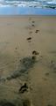
| 10/21/2004 07:17:29 AM |
Recess Rules!by debitiptonComment: Nice capture in terms of the boys' expressions and I like the angle you've chosen. The photo is a bit overexposed for my taste. I would like to see more shadow detail in the sand and the tire treads, etc. |
| Photographer found comment helpful. |
| 10/21/2004 07:13:58 AM |
Hampton School No. 9by coolharComment: This is a cute little school house and you've met the challenge. However, I find this to be a pretty cold and sterile image. There isn't much going on in terms of light and shadow and the builiding just isn't interesting enough (to me, anyway) to carry so much weight of the photo. A human element or more dramatic lighting might help. |
| Photographer found comment helpful. |
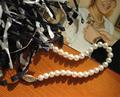
| 10/21/2004 07:10:20 AM |
Homecomingby natatbeachComment: A nice idea for a still-life. It is a bit overexposed. You've lost quite a bit of detail. This nearly directly overhead angle is the best for a still-life. I suggest shooting from a lower vantage point and side lighting to heighten the drama--you will capture more interesting shadow detail. |
| Photographer found comment helpful. |
| 10/21/2004 07:07:47 AM |
Stepsby FedericoComment: This is a decent photo (although the narrow cropping is a bit stingy, IMO) but the connection to the challenge seems rather tenuous. |
| Photographer found comment helpful. |
| 10/21/2004 07:06:04 AM |
|
| Photographer found comment helpful. |
| 10/21/2004 07:04:45 AM |
Tune it upby ssodellComment: School? Education? I don't see a connection to the challenge here. A guitar lesson? This seems a bit like shoehorning to me.
In terms of the quality of the photo---it appears quite a bit overexposed. There is very little shadow and highlight detail. There isn't really much of an interesting focal point accept for the orange finish of the guitar. Sorry, this one just doesn't work for me at all. Keep trying! |
| Photographer found comment helpful. |
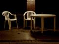
| 10/20/2004 12:17:30 AM |
Closedby GolferDDSComment: Nice take on what could have been a very mundane scene. I like the contrast of the white chairs and the darkness in the background. Good lighting. |
| Photographer found comment helpful. |
| 10/20/2004 12:16:02 AM |
Sleeping GIANTby dacrazyrnComment: Very unique take on this challenge. The yellow, blue and purple make for a vibrant and dynamic.The framing of the backhoe is really dramatic. It has the feel of a psychedelic album cover. |
| Photographer found comment helpful. |
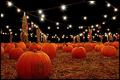
| 10/20/2004 12:14:16 AM |
Pumpkin Patchby markmyshotsComment: I like the unique take on this challenge. The colors are great. This would make a fun Halloween postcard. Good job! |
| Photographer found comment helpful. |
Home -
Challenges -
Community -
League -
Photos -
Cameras -
Lenses -
Learn -
Help -
Terms of Use -
Privacy -
Top ^
DPChallenge, and website content and design, Copyright © 2001-2025 Challenging Technologies, LLC.
All digital photo copyrights belong to the photographers and may not be used without permission.
Current Server Time: 08/27/2025 02:37:55 AM EDT.