| Image |
Comment |
| 12/22/2005 04:27:28 PM |
Disappearing actby holidayComment: I think you could have used a different background for the flowers than a wooden table top. The peachy colored background clashes with the violet. Pure white would have been more effective. I don't like the black empty space at all. Maybe this could have been shot from a sharper angle? Good focus on the foreground flower. |
 Photographer found comment helpful. Photographer found comment helpful. |
| 12/22/2005 04:25:04 PM |
|
| Photographer found comment helpful. |
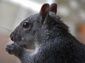
| 12/22/2005 04:24:00 PM |
Lunch Timeby NstiG8trComment: Nice color and composition. I like that the curvy lines of the squirrel's back and tail are echoed in the snow bank. The negative space is broken up very nicely. Very nice sharp detail on the squirrel. |
| Photographer found comment helpful. |
| 12/22/2005 04:19:36 PM |
|
| Photographer found comment helpful. |
| 12/22/2005 04:11:54 PM |
Presentiment of Deathby grusComment: This is kind of hokey for my taste and almost as a rule I hate selective desaturation, but I do like the background quite a bit. I like the the way the gates create a visual maze leading you in and out of the picture. I think I would have enjoyed this more without the dying flower and instead the focus being on the headstone. The flower just interrupts my enjoyment of the background. |
| Photographer found comment helpful. |
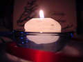
| 12/22/2005 04:08:15 PM |
Light at the End of Christmasby MansonsdesdemonaComment: A nice effort. I don't quite understand your title. I think a colored card for the blurred background would have been more effective in adding some interest than then one that is shown here. The red ribbon in the front looks like a stab at framing and using color for contrast but I think the red would have been more effective in the background (as previously noted regarding the card). The ribbon isn't quite framing the shot so much as adding a distracting element to the composition. The sphere of light created by the flame would have been a nice visual element as it echoes the curves on the rim of the bowl and the bowl itself, but it winds up competing for attention with the red and blue ribbons and the busy looking graphic on the card. I think eliminating the ribbons would have made this a much simpler, effective image. The size of this entry borders on being to small to effectively evaluate, for future reference. |
| Photographer found comment helpful. |
| 12/22/2005 03:57:11 PM |
BONUSby bikefreakComment: I like the color and the pinball machine as subject matter but ultimately the blurred background looks more interesting to me than the foreground. |
| Photographer found comment helpful. |
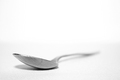
| 12/22/2005 03:54:46 PM |
The Spoonby lowonenergyComment: This could have been sharper around the rim of the spoon. I feel like the spoon could be looming a bit larger in the frame. This small, it lacks the boldness it takes to make a shot of an ordinary object really dynamic. I like the nice soft blur of the handle in the distance and the pristine white background . |
| Photographer found comment helpful. |
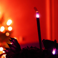
| 12/22/2005 01:47:01 PM |
Crimson Zenby elee3009Comment: I like the bold contrast of purple and orange and the blurred lights in the background. The smaller incense stick and the odd lumpy shape behind complicate the composition. |
| Photographer found comment helpful. |
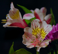
| 12/22/2005 01:44:53 PM |
Alstromeria: Peruvian lilyby AzCKellyComment: This is kind of ho-hum to me. I think eliminating the mums in the background so that there is only a single species represented would have lent more weight to your title and made for a simpler composition. The bright magenta, although it is blurred draws the eye to no effect. The leaf at the bottom of the frame should have either been cropped or placed in the frame in a more thought out way. As it is, it is competing with the flower for focus. |
| Photographer found comment helpful. |
Home -
Challenges -
Community -
League -
Photos -
Cameras -
Lenses -
Learn -
Help -
Terms of Use -
Privacy -
Top ^
DPChallenge, and website content and design, Copyright © 2001-2025 Challenging Technologies, LLC.
All digital photo copyrights belong to the photographers and may not be used without permission.
Current Server Time: 08/26/2025 03:56:50 PM EDT.