| Image |
Comment |
| 12/25/2005 12:35:43 PM |
Lingerieby BruBComment: It took me a second to find evidence of shallow DOF in this. I actually like this composition quite a bit. I like the panties used as a design element with the unorthodox amount of empty space above (I'm find of this type of composition although I prefer a narrower, more vertical frame when utilizing it). Sadly, I don't really think shallow DOF does anything to enhance this composition. It actually detracts from the what could be a crisp and clean graphic statement. For this composition to work really well the focus needs to be very crisp and the pink needs to really be separate from the white. I would enjoy seeing this done again with a vertical frame and very sharp focus, no shadows,and a perfectly spotless white background so that it appears as one graphic statement. |
 Photographer found comment helpful. Photographer found comment helpful. |
| 12/25/2005 12:30:19 PM |
Fresh Pointsby oOWonderBreadOoComment: Not super original but it works okay. I'm a bit distracted by the crumbs from the the pencils being freshly sharpened. I think this would work better with a new set of pencils (although there is a personal quality in that these are regularly used by someone). Maybe if they were set up with some art work in progress or some other well-used artist materials? |
| Photographer found comment helpful. |
| 12/25/2005 12:27:34 PM |
Scooters - It's just a better Cupby LedZeppelin588Comment: It's not a particularly visually appealing cup, sadly. It's kind of drab and colorless. I think if you had eliminated the paper insulator it might have been a little better-- I don't really know what the cup looks like. Perhaps this would be less boring if you could see someone in the background enjoying a cup. All, I can make out is an arm (it took me awhile to figure it out--I thought at first it was a jacket thrown over the chair) and a bit of blue jeans). |
| Photographer found comment helpful. |
| 12/25/2005 12:25:14 PM |
|
| Photographer found comment helpful. |
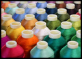
| 12/23/2005 12:21:51 PM |
White in the Middleby AlanBesComment: This could work for the pattern challenge also. Nice colors, good textures and pleasing cropping. In this instance, I like the bold black frame for the way it emphasizes the bright colors and shiny texture of the threads. |
| Photographer found comment helpful. |
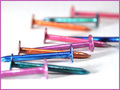
| 12/23/2005 12:20:11 PM |
Nail Polishby brizmamaComment: I don't care for the pink frame but I like the colors of the photo and the high key lighting. There is a reasonably good composition here in the way the eye travels nicely from front to back. Definitely utilizes shallow depth of field well. |
| Photographer found comment helpful. |
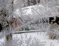
| 12/22/2005 04:41:30 PM |
Frostingby dphillipsComment: Very pretty subject. The background is a bit busy, the various vertical and horizontal planes compete to much with the subject to really alow it to pop. A slightly diferent angle, elimnating the tree and that black and beige shape at the right of the frame would have helped a bit. Those two areas compete the most for my attention. |
| Photographer found comment helpful. |
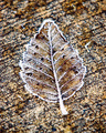
| 12/22/2005 04:37:58 PM |
Leaf Frostingby slackboyComment: Perhaps if the image were bigger I would get more of a feeling of shalow DOF in this but at this size it is really difficult to see a major difference in the focus. I would not have placed the leaf against such a busy, similarly colored and textured background. It all looks like one flat brown mess to me. Sorry. |
| Photographer found comment helpful. |
| 12/22/2005 04:34:46 PM |
TICONDEROGAby lectrolComment: A good idea but a more thoughtful arrangement of the pencils would make a better composition. This seems rather haphazard. There is a distracting shadow behind the pencil on the far left of the frame. |
| Photographer found comment helpful. |
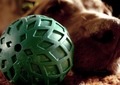
| 12/22/2005 04:33:30 PM |
Her ballby KivetComment: I just wish her ball wasn't this hideous green thing. It doesn't make for a compelling focal point and it completely dominates the image. The remainder is taken up by a distorted view of the dog's nose, particularly her nostril.The ball is a rather noxious shade of green and it doesn't harmonize well with the peachy, browns of the rest of the frame. The dog is really cute. I think in this case, focusing more on the dog (the interesting subject matter) and less on the ball would have worked. I would like to see the sparkle in the dog's eyes, instead I am given a much closer view of her nostril than I care for. |
| Photographer found comment helpful. |
Home -
Challenges -
Community -
League -
Photos -
Cameras -
Lenses -
Learn -
Help -
Terms of Use -
Privacy -
Top ^
DPChallenge, and website content and design, Copyright © 2001-2025 Challenging Technologies, LLC.
All digital photo copyrights belong to the photographers and may not be used without permission.
Current Server Time: 08/26/2025 01:29:23 PM EDT.