| Image |
Comment |
| 12/28/2005 10:40:18 AM |
|
 Photographer found comment helpful. Photographer found comment helpful. |
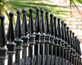
| 12/28/2005 10:39:09 AM |
Bill's Gate...no not reallyby fivebalesComment: A nice subject for the challenge. The background needs to be blurred quite a bit more and the shadow details on the rails are blown out. |
| Photographer found comment helpful. |
| 12/28/2005 10:38:16 AM |
Brighton Pitternby DoigComment: Ahhh! You left some kind of stamp in the lower right corner of the frame! I like the idea here although it is verging on business. I'm wondering if a vertical format isoloating a single one of those lamp areas might have been more effective. I don't think the neon sign is adding much in terms of pattern. |
| Photographer found comment helpful. |
| 12/28/2005 10:36:28 AM |
|
| Photographer found comment helpful. |
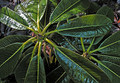
| 12/28/2005 10:34:16 AM |
Rhododendron Hodgsoniiby GeeeComment: A nice idea that could use a bit more work. The glare on the leaves is what really wrecks this for me. The background that is visible in three corners of the frame is a minor nit compared to that. |
| Photographer found comment helpful. |
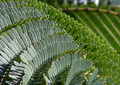
| 12/28/2005 10:33:22 AM |
Natures Patternby MackComment: A good idea and thoughtful composition. The foreground needles look a bit blown out and the area at the top right of the frame distracts me a bit. Still, one of the better efforts I've seen so far. |
| Photographer found comment helpful. |
| 12/28/2005 10:31:59 AM |
Dotsby CalliopeKelComment: This is a clever and appealing shot. I like the blue eye echoing the dots of the fabric. Nice tight crop eliminates distracting details. |
| Photographer found comment helpful. |
| 12/28/2005 10:28:53 AM |
Wrap Of The Seasonby TUBORGComment: An interesting idea. I think an infinite depth of field would have been more effective---it would have flattened the image into a single plane which I think would be create a more striking pattern. The blurry areas aren't reallly doing much for me. |
| Photographer found comment helpful. |
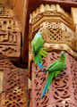
| 12/28/2005 10:25:27 AM |
Hey, What Are You Looking At?by fiveriversComment: This seems to be more about the birds than pattern. The pattern is just background. A tighter well focused crop isolating a single area of the patterned wall would have made a stronger statement about pattern. |
| Photographer found comment helpful. |
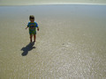
| 12/28/2005 10:21:44 AM |
Ripplesby carloComment: I like this quite a bit as a portrait of childhood. However, the ripples don't really stand out enough for me to suggest pattern. I think a tight crop of the water taken at a side angle to capture the play of light, shadow, and reflection would have revealed more about the patterns that water makes. This photo really is more about the baby. |
| Photographer found comment helpful. |
Home -
Challenges -
Community -
League -
Photos -
Cameras -
Lenses -
Learn -
Help -
Terms of Use -
Privacy -
Top ^
DPChallenge, and website content and design, Copyright © 2001-2025 Challenging Technologies, LLC.
All digital photo copyrights belong to the photographers and may not be used without permission.
Current Server Time: 08/26/2025 11:00:53 AM EDT.