| Image |
Comment |
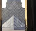
| 04/28/2004 08:38:04 PM |
Louvre Pyramidsby chinkenminComment: Perhaps if you had framed this so that only the glass structures were included? I generally like doorways for framing the subject but they aren't working hard enough here. |
 Photographer found comment helpful. Photographer found comment helpful. |
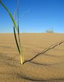
| 04/28/2004 08:34:24 PM |
The Shady Proportions of Time.by boredComment: I wonder if you needed to include so much sky, if any, in this photo? I cropped it by scrolling up to obscure the sky and I liked it much better. I also like it with just the thinnest strip of blue at the top. Try it, you'll like it. High marks for the excellent detail in the sand and shadow. |
| Photographer found comment helpful. |
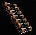
| 04/28/2004 08:32:10 PM |
Copper Topsby Beerme425Comment: This is an nice abstract composition. I don't love it but its one of the best photos I've seen today. |
| Photographer found comment helpful. |
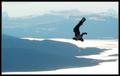
| 04/28/2004 08:30:54 PM |
Unassisted Flightby mbardeenComment: Lose the distracting double-border. Otherwise, this is one of the better shots of seen today. Could use some more sharpness in the first two foothills. The washed out color leaves much to be desired. I can't tell if that's snow or water. |
| Photographer found comment helpful. |
| 04/28/2004 08:27:49 PM |
Natural Proportionby Arnoldo_costa ricaComment: This is way too out of focus to qualify as a competent photograph. The composition is good, however, and the subject meets the challenge. Low marks because of the crappy focusing. |
| Photographer found comment helpful. |
| 04/28/2004 08:26:09 PM |
A Small Space and Lots of Cowsby LN13Comment: This is a lot of cows but you haven't conveyed a sense of small space. There seems to be a lot of space here. Since there is no fence to indicate confinement one has to assume there is more pasture than what can be captured in the viewfinder. There certainly seems to be plenty of land in the horizon. There are cows hanging out at the edges of the frame on either side as well as way in the back near the first horizon line where the grass meets the trees. This leads the viewer's imagination to assume there is more space if we could just see over that hill and beyond the edges. In order to convey a sense of tight quarters you should have come in a lot closer to fewer cows and omited the vast expanse of trees and sky in the background. Disregarding the challenge theme, these cows are too far away to make much of a visual impact other than black and white blobs on a washed out landscape. |
| Photographer found comment helpful. |
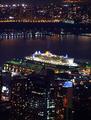
| 04/28/2004 08:10:54 PM |
Filling the Dock: QM2 in New Yorkby cmberghoutComment: This is a very pretty skyline shot. Sadly,it seems quite a bit out of focus so a lot of the impact is lost. The challenge has been met because one truly sees how huge this ship is when comparing it to the equally huge skyscrapers. High marks for overall composition and meeting the challenge. |
| Photographer found comment helpful. |
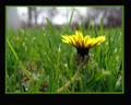
| 04/28/2004 08:05:03 PM |
Bugs Viewby rwingardComment: This is a pretty, backlit shot of a dandelion. I'm not sure how it illustrates proportion. Cropping that strip of blurry sky at the top, and about 1/4 off the left edge would improve this imensely making it a nearly monocromatic image and letting the yellow really pop. I would lose the green border. |
| Photographer found comment helpful. |
| 04/28/2004 08:02:00 PM |
It's my turn to torture you BIG sister!by NeuferlandComment: Clever use of forced perspective and you did it right by keeping the background very simple. I like the color contrasts. I'm a little suspicious of that line that intersects the frame about two-thirds up but it looks like it could just be the line of shadow from a hilly landscape. |
| Photographer found comment helpful. |
| 04/28/2004 07:52:26 PM |
Little Tree on a Big Treeby postoakinversionComment: A nice idea which does illustrate proportion. This image fails asthetically, however. It lacks impact and visual interest outside of the interesting texture of the bark. |
| Photographer found comment helpful. |
Home -
Challenges -
Community -
League -
Photos -
Cameras -
Lenses -
Learn -
Help -
Terms of Use -
Privacy -
Top ^
DPChallenge, and website content and design, Copyright © 2001-2025 Challenging Technologies, LLC.
All digital photo copyrights belong to the photographers and may not be used without permission.
Current Server Time: 08/23/2025 06:05:40 PM EDT.