| Image |
Comment |
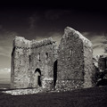
| 04/07/2006 12:18:22 PM |
Weobley Castleby cheekymunkyComment: The sky looks great. I like the composition and the subject matter. It is a bit contrasty but in this case, I think it works. Since this is an advanced editing challenge I would have cloned out the bit of tree at the edge. |
 Photographer found comment helpful. Photographer found comment helpful. |
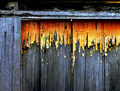
| 04/07/2006 12:16:33 PM |
The Forgotten Doorwayby GIS_boyComment: A little dark and contrasty (especially at the top edge) but I like the colors and the cropping. I think if most of the top edge where it is really underexposed were cropped out, leaving just a narrow strip of darkness, it would improve quite a bit. |
| Photographer found comment helpful. |
| 04/07/2006 12:14:00 PM |
|
| Photographer found comment helpful. |
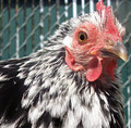
| 04/07/2006 12:13:33 PM |
Chickenby ChilibeanComment: Great capture of the eye and nice cropping. The highlights are a bit blown out for me. I'd like to see a bit more detail in those areas. |
| Photographer found comment helpful. |
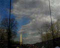
| 04/07/2006 12:12:16 PM |
Fallen Heroesby SJCarterComment: Interesting but it seems to be more of a study of reflections than texture. Although, on second thought, the reflections are there because of the texture so I guess this works. Still, for a challenge which, in my view, is essentially a technical one, I think the textural quality should be more apparent. I'm not crazy about this type of subject matter but the reflections of the clouds, trees, and monument add interest and mood. The reflections of the vistors at the bottom, however are merely distracting and should have been cropped out, IMO. |
| Photographer found comment helpful. |
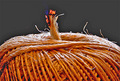
| 04/07/2006 12:05:57 PM |
Twine String Burningby eaglebeckComment: Very nice lighting and image quality. Good capture of the burning twine. Perhaps a more square crop though? |
| Photographer found comment helpful. |
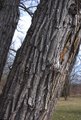
| 04/07/2006 12:05:14 PM |
A Tree in the Parkby kashiComment: I think for this sort of study, a much tighter crop is necessary. We don't really need to see the grass and other trees in the background, even in blur. |
| Photographer found comment helpful. |
| 04/07/2006 12:03:32 PM |
Delicateby fplouffeComment: Very nice detail. I wish the background were either very black or very white. I'm not crazy about this slate color that I'm getting on my monitor. I think because it is very similar in tone to the rest of the image and I'd like to see the flower pop out more from the background. |
| Photographer found comment helpful. |
| 04/07/2006 12:00:53 PM |
Just Charleyby NigelComment: His eyes look very lifeless to me. I'm seeing reflections of what could be flash in the pupils so maybe that is the problem. There isn't enough area in sharp focus to really get a sense of the furry texture. The cropping is good. |
| Photographer found comment helpful. |
| 04/07/2006 11:57:44 AM |
Feel the earthby KitaComment: I like the saturated colors of the boys clothes in contrast to the more neutral background. His skin has that overly smooth, plastic-looking processed quality that I find disturbing though. The composition is a bit weird to me. |
| Photographer found comment helpful. |
Home -
Challenges -
Community -
League -
Photos -
Cameras -
Lenses -
Learn -
Help -
Terms of Use -
Privacy -
Top ^
DPChallenge, and website content and design, Copyright © 2001-2025 Challenging Technologies, LLC.
All digital photo copyrights belong to the photographers and may not be used without permission.
Current Server Time: 08/24/2025 03:25:17 AM EDT.