| Image |
Comment |
| 05/10/2004 07:30:24 PM |
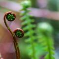
New ferns dancing in the Olympic Rain Forestby cabaComment: I gave this a five. The subject is interesting and there's nice use of shallow depth of field. I'm not sure a horizontal format was the best choice to show of this interesting plant. There isn't quite enough detail in the spiral section of the plants. The lower one is a bit out of focus. |
 Photographer found comment helpful. Photographer found comment helpful. |
| 05/10/2004 07:25:26 PM |
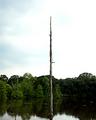
Lone Treeby omnibusComment: I gave this a four. A closer view might have helped if that was possible. The image is very high key and contrasty. It is difficult to see any detail between the overexposed reflections and sky and the underexposed shadows. The color is rather harsh and cold for this scene. |
| Photographer found comment helpful. |
| 05/10/2004 07:22:19 PM |
Fire Waterby sevenine0Comment: I gave this a four. The mood is nice but the shot is blurry (a tripod would have been useful). Your title says Fire Water yet there is no evidence of fire, probably because of the blur. |
| Photographer found comment helpful. |
| 05/10/2004 07:20:18 PM |
Butler County Landmarkby jpochardComment: I gave this a four. The image is quite a bit tilted, as you'll notice if you look at the steps and the podium (or whatever that structure is in the foreground).The podium thing itself is a big distraction in the foreground. The tree at the edge of the frame is very distracting. It would have been better to find a different position to eliminate unecessary objects in the frame. That glowing spot over the door keeps leading my eye right to it without a payoff. The real interest in this image is the contrast of color between the twilit sky and the architectural details at the top of the building. |
| Photographer found comment helpful. |
| 05/10/2004 06:51:17 PM |
Tulipsby willtataComment: This is a pretty garden but this image is too small to appreciate the shot. I'm not sure it would be significantly better at a larger size. The colors are rather drab and washed out. The tulips aren't really massed enough to warrent filling the frame with so many. Picking a single flower and finding a position that would show the light penetrating the translucent petals is one way to show flowers at their best in a photograph.I would classify this as a rather pedestrian snapshot.I gave it a four. |
| Photographer found comment helpful. |
| 05/10/2004 06:43:38 PM |
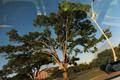
Minivan Reflectby koltrane75Comment: Sorry, I gave this a three. It just seems to be a snapshot you took out of a moving car. While that may be a place you've never taken pictures before, it doesn't make this an interesting shot. The wierd angle serves no visual purpose. |
| Photographer found comment helpful. |
| 05/10/2004 12:59:59 AM |
Freedom of speech.by DufusComment: This got a 7 from me because I'm a big fan of street photography and photojournalism and this really works. It might have gotten higher but I'm not sure I like that the foremost picketer has his face cut off. If it was your intention to include the hotel sign at the top of the frame, I can see why you would choose this odd point of view. Otherwise, I wonder why you didn't aim just a bit lower? |
| Photographer found comment helpful. |
| 05/10/2004 12:49:14 AM |
Irisby LucidLotusComment: Love the color, shape and texture of the flower. Not sure the fuzzy blue vase at the lower edge is doing much. |
| Photographer found comment helpful. |
| 05/10/2004 12:48:00 AM |
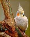
A Cockatielby trainComment: A very nice animal portrait. I little blah for my taste though. |
| Photographer found comment helpful. |
| 05/10/2004 12:47:14 AM |
Global Village at Ricks American Cafeby TooCoolComment: This got a 5 from me because there is a mike growing out of the bass player's head and he has a second head growing from his shoulder. The color is too orangey. I realize this is nightclub lighting but I feel it could be toned down some. I like the blurring of the singer's hand. |
| Photographer found comment helpful. |
Home -
Challenges -
Community -
League -
Photos -
Cameras -
Lenses -
Learn -
Help -
Terms of Use -
Privacy -
Top ^
DPChallenge, and website content and design, Copyright © 2001-2025 Challenging Technologies, LLC.
All digital photo copyrights belong to the photographers and may not be used without permission.
Current Server Time: 06/26/2025 08:31:11 AM EDT.