| Image |
Comment |
| 09/09/2003 12:16:58 PM |
|
 Photographer found comment helpful. Photographer found comment helpful. |
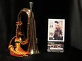
| 08/26/2003 03:04:45 PM |
Lost Past - Last Postby hughletherenComment: Ireally like the lighting on the bugle but the composition is off. I think that the photo is a bit too small i and the stark white edging is a bit jarring next to the softness of the lighting on the bugle bugle and the cassette doesn't add anyhting to the compositon. You got potential here for an intresting photo , maybe put the photo in a frame or have some other military patches or medals. |
| Photographer found comment helpful. |
| 08/26/2003 12:08:07 PM |
Summer Daydreamsby neenee1999Comment: I think there is too much stuff going on in the background. if you had cropped out the banner and maybe shown a bit more of the blanket and her leg, think you would have put more emphasis on your young model. maybe a bit more color saturation on the care bears would have helped too.just a thought you had some really nice stuff going on |
| Photographer found comment helpful. |
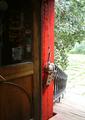
| 08/13/2003 12:31:08 PM |
Inside looking out!by RobroComment: this has some nice elements wished the outside light weren't as bright. wondering did you bracketed your shot . it would been nice to pick up more outside detail |
| Photographer found comment helpful. |
| 08/12/2003 09:25:41 AM |
the dawningby nbortonComment: I would have liked to seen the top of the building but as I refer to it you caught the sweet light. nice |
| Photographer found comment helpful. |
| 08/07/2003 09:30:49 AM |
|
| Photographer found comment helpful. |
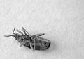
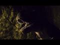
| 08/06/2003 12:27:21 PM |
Jurassic Parkby jenaromComment: Really like where you were headed with this just wish you could have just picked up bit of glint / highlight in its eye, not sure if it the monitor, in the office, the right side is really very dark would have liked to see a little more of his neck very sublty seperation from backgound but again it could be the monitor. |
| Photographer found comment helpful. |
| 08/06/2003 12:19:12 PM |
Cats and Dogsby patriciabrown2001Comment: wish the background could have had been less in focu and saw bit more of the little one's paw but nice shot , |
| Photographer found comment helpful. |
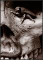
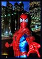
| 08/06/2003 12:14:37 PM |
Spider Manby MiekaComment: not bad but was wondering if you diffused the light source and if you placed more distance between the figurine and background to soften the shadows , it might have made for a more realistic shot |
| Photographer found comment helpful. |
| 08/05/2003 02:53:00 PM |
|
| Photographer found comment helpful. |
Home -
Challenges -
Community -
League -
Photos -
Cameras -
Lenses -
Learn -
Help -
Terms of Use -
Privacy -
Top ^
DPChallenge, and website content and design, Copyright © 2001-2025 Challenging Technologies, LLC.
All digital photo copyrights belong to the photographers and may not be used without permission.
Current Server Time: 08/01/2025 04:21:45 PM EDT.