| Image |
Comment |
| 07/21/2003 02:23:42 PM |
|
 Photographer found comment helpful. Photographer found comment helpful. |
| 07/18/2003 06:54:39 PM |
Roundaboutby kengurinnComment: Very good approach of the challenge and very well composed. Just too bad that the brightness of the wall behind the boy is too overwhelming. Despite that, good job!
|
| Photographer found comment helpful. |
| 07/18/2003 06:40:37 PM |
|
| Photographer found comment helpful. |
| 07/18/2003 06:28:25 PM |
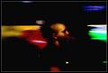
Round-Headby NazgulComment: I like the way the lights are on the same level as the head. The combinaton of colors and sence of movement is very good. Great photo! |
| Photographer found comment helpful. |
| 07/18/2003 06:14:45 PM |
|
| Photographer found comment helpful. |
| 05/12/2003 03:41:51 PM |
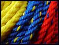
Primary Ropeby KazComment: Very nice how the blue rope contains a yellow string and the red rope a blue one :) |
| Photographer found comment helpful. |
| 05/09/2003 05:36:54 PM |
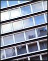
This is the titleby marcoComment: I like the angle you used. What I like the most though, is the dark lines between the rows of windows contrasting with the white window-frames. Great photo! |
| Photographer found comment helpful. |
| 05/09/2003 05:01:21 PM |
Bottle glass - worn by the seaby paynekjComment: Great usage of empty space and very appealing colors. I find the abrupt crop at the bottom disturbing though. Somehow, I'd like to see either the whole bottom of the botle or a much stronger crop so only half of the bottom would be visible. |
| Photographer found comment helpful. |
| 05/09/2003 04:46:45 PM |
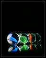
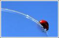
Round and Round by JackoComment: Wonderfull photo: simple, clean and great usage of color.
I do have a point of critismn though: I think the left edge of the glas being out of focus, caused by the narrow DOF, is confusing. Because it's not in focus it doesn't function as a leading line towards the ladybug. |
| Photographer found comment helpful. |
| 05/08/2003 02:52:34 PM |
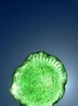
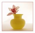
Yellow Glassby joannsComment: I like the style and the colors fit very well together. One note though: instead of placing the object in the middle of the photo, I think in this case it would make a better composition if it would be placed more towards the right side of the photo. The empty space a the left will be in balance with the object at the right then.
Just my opinion :) |
| Photographer found comment helpful. |
Home -
Challenges -
Community -
League -
Photos -
Cameras -
Lenses -
Learn -
Help -
Terms of Use -
Privacy -
Top ^
DPChallenge, and website content and design, Copyright © 2001-2025 Challenging Technologies, LLC.
All digital photo copyrights belong to the photographers and may not be used without permission.
Current Server Time: 08/23/2025 02:22:50 AM EDT.