| Image |
Comment |
| 12/29/2007 09:38:30 AM |
For all the days you already missedby heavyjComment: Nice idea and styling, but the execution deserves a lttle more attention. Not quite sure what you did whith the bg for instance, but it looks messy, as if you dodged and burned it carelessly. Bot hands are in awkward position, and it seems your right hand comes from outside the picture. Other (minor) technicalities include the flash reflection on the magazine and the tight crop on the upper side. |
 Photographer found comment helpful. Photographer found comment helpful. |
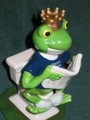
| 12/29/2007 09:33:17 AM |
"A frog by any other name".by jjsmomComment: Yep, that's a silly gift. I don't like the harsh lighting and shadow though, nor the very central composition. This litlle item could hve been displayed in a much more spectacular way IMO. How about a low angle close-up for instance? That would have also given you the oppotunity to create a larger pic, which would have worked better. |
| Photographer found comment helpful. |
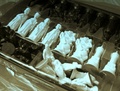
| 12/29/2007 09:16:18 AM |
missing pieceby csl_click79Comment: It's hard -if not impossible- to make a pleasant composition from things still in the box. I think you should have taken them out. That would also help the viewer to see there are only seven pons. Some of the whites are slightly blown in the picture and the whites have a blue cast, indicating that your WB is incorrect. |
| Photographer found comment helpful. |
| 12/29/2007 09:10:23 AM |
Very useful wigby kiskatComment: I like the idea and the expression is fitting, but the pic does not seem to be in focus and the (oversharpened?) glitters and glimmers are very distracting. They seem to move from right to left. |
| Photographer found comment helpful. |
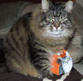
| 12/29/2007 08:56:54 AM |
We are not a-mew-sed by a Cat's Meow Christmasby flickerslairComment: That IS a stupid gift, I have to agree :D I like your title too, but I am not too fond of the pic, I must say. It think it would benefit from a more exciting composition than just the cat plain in the middle of the pic. I also feel there is something wrong in the lighting. The pic lacks contrast overall, but the cat ON the CD has blown out highlights, thus directing the eyes of the viewer to the CD, rather than to the face of the real cat. On top of all that, you chopped of one of the eartips. |
| Photographer found comment helpful. |
| 12/29/2007 07:40:28 AM |
Grow a Buddhaby handicapjoeComment: I am not too fond of photographs where someone simply makes a flat pic of something. You might as well put it under the copier. Please devote more time to composition and lighting to make your subject stand out and generate an appealing picture. |
| Photographer found comment helpful. |
| 12/29/2007 07:38:03 AM |
100 pairs of socks: ask for them and you get them!by Yo_SpiffComment: Nor sure from the pic whether these are socks, towels or any other type of cloth. ANd you'll have to agree that if I can't see what is depicted in a photograph, it's probably not a very good one, unless it's an abstract. I think this pic has two main problems:
1) lighting, or better, the reflection of light from the plastic
2) composition: in the sense that it lacks one. I am sorry to say it this rude, but I realy feel you should have devoted some time to creating a nice composition and show the viewer that these are actually socks. |
| Photographer found comment helpful. |
| 12/29/2007 04:43:03 AM |
An empty boxby shenanigansComment: hmmm, not a very appealing pic, alhough some people may like the weird POV and concept. I do appreciate the weird nature of the pic, but I am bit put of by the harsh shadows and the many distractions. As to PP, I think it is generally strong, but it seems to be overdone relative to the IQ of the original picture. I would love the see you repeat this type of PP to a well-lit portrait someday. |
| Photographer found comment helpful. |
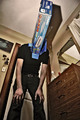
| 12/29/2007 03:59:26 AM |
Stupid and frustratingby JudiComment: Nice. Love the use of shallow DOF combined with the suggestion of nudity. Not clear to me why the cube misses the centers and has a hole. Is this a specific type or is it justbroken? I find the shadows of the hand and cube a bit distracting, whereas the overall lighting is so much better. |
| Photographer found comment helpful. |
| 12/29/2007 03:56:08 AM |
|
| Photographer found comment helpful. |
Home -
Challenges -
Community -
League -
Photos -
Cameras -
Lenses -
Learn -
Help -
Terms of Use -
Privacy -
Top ^
DPChallenge, and website content and design, Copyright © 2001-2025 Challenging Technologies, LLC.
All digital photo copyrights belong to the photographers and may not be used without permission.
Current Server Time: 08/23/2025 09:02:09 AM EDT.