|
|
|
Showing 981 - 990 of ~2866 |
| Image |
Comment |
| 08/17/2005 12:36:41 PM | Splashby johansecComment: I think this lacks a sense of drama, which might have been usefully increased with some contrast work, especially around that spray of water, which simply shades into greyness. |  Photographer found comment helpful. Photographer found comment helpful. |
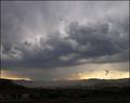
| 08/17/2005 12:33:45 PM | "The Monsoon Season"by tfarrell23Comment: Very strong indeed - reminds me of Simon Norfolk, who is a genius (so that's a high compliment indeed). I would love the foreground t have been pulled up a little, just to reveal some more detail in those buildings (and I don't mean throwing the dodge and burn at it indiscriminately). The tonality and light in the sky is wonderfully caught, and it remain purely photographic; very high standard. | | Photographer found comment helpful. |
| 08/17/2005 12:31:00 PM | A Kids Dreamby jenesisComment: Good contrast, strong composition, colour, exposure. I like it, but couldn't go overboard about it. Solid work. | | Photographer found comment helpful. |
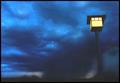
| 08/17/2005 12:29:34 PM | Cloud burstby armelleComment: There's an odd, almost water-colour-esque feel to this image (not out of place, I suppose). I can see arguments both for and against the inclusion of the lamp-post, but oh, for it to be straight. Colour tones are good, and the sense of greyness, of dullness is well achieved. Without the post, it might have an almost turner-like quality of light about it. | | Photographer found comment helpful. |
| 08/17/2005 12:20:43 PM | Hibiscus in the Rainby Buckeye_FanComment: I like the tonality here, and your control of exposure, which is impeccable. I think you've lost a little of the sense of finest detail, probably from the smallness of the file size of the image, whihc has also lead to those blurry lines about high-contrast edges. I'm not convinced about the composition overall either: its quite simplistic, and i think something stronger would make more immediate impact - especially in a challenge here there are doubtless many many flower photographs. But there remains a lot to like here. | | Photographer found comment helpful. |
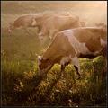
| 07/31/2005 08:55:28 PM | in morning lightby frumoazniculComment: from the terminal lounge of the Critique Club
There's a very strong sense of place, of time, and of mood to this shot; which is, really, faultless in it's execution. The process from rear of image to foreground, the increasing contrast, is an effective and often forgotten means to give depth to an image without resorting to the simpler effects of shallow depth of field. I wonder if it's that factor that gives me slight reservations about the extreme foreground - the fact that the drift out of focus there presents a contrasting approach to communicating depth in the image? Given the lovely subdued detail of the background, I wonder if that touch more of similar textures in the foreground might not make the entire shot more harmonious? It may seem like a minor point, but I think it may have a subconscious impact ...
That same factor comes into play when considering the composition as a whole. It works well for the square crop - you've used the strong diagonal with that shaft of sunlight very cleverly to work both with and against the grouping of the cows - I note the way the two cows that echo each others' positions occupy the centre-left two thirds, and the top line of animals occupies the upper third. However the curve of the line formed by the cows' heads, and the end-point of that diagonal of light, brings quite a bit of attention to the bottom left of image, which is where your depth of field runs out - again, re-inforcing that slight sense of disappointment that the detail is lacking there. Obviously, the tetures of those grasses is not the point of your shot - but your composition makes it quite important, and a strong part of the means of keeping the motion of the viewer's eye moving through the image.
Your processing seems pretty competent - little to criticise there. I would guess that there was a trade-off between keeping that lovely sense of haze and the levels of contrast, and likewise keeping the warm feeling versus that sense of false colour-temperature. I would have tried a warm-toned mono version, I think: that would keep that sense of mood, and perhaps negate the slight sense of false colour in the grass. But those are experimental suggestions, and I'm not suggesting that they would certainly work. Given the wideness of the advanced editing rules, I think you might have generated a touch more impact in the foremost cow - just a pushing of contrast perhaps, something to strengthen the textures of it's flanks. Again, an experimental suggestion.
Of course, challenge-wise, this shot will simply have beeen dismissed and passed-over by very many voters. I've certainly seen cows in zoos - but for most voters, the idea of the zoo is specifically about unusual and exotic animals one mightn't find wandering around just outside your city. Of course, you're hard done-by in that sense; but my guess would be that you weren't that surprised.
I hope a couple of those thoughts are at least useful.
Ed Message edited by author 2005-07-31 20:56:05. | | Photographer found comment helpful. |
| 07/25/2005 09:00:43 AM | Fairyland by heidaComment: There's always a fine balance to be struck in the processing of such images - to maintain the feel of the photographic, and yet to approach the painterly. I think you get pretty close to that line, and yet remain on the right side of it. The vignetting is perhaps a touch strong, yet believable. Technical processing is good - great sense of detail and texture. | | Photographer found comment helpful. |
| 06/15/2005 03:59:43 PM | chesterton_3.jpgby nordicComment: In my opinion this is a much more intriguing (and vastly better) image than the challenge entry. The ribbon-winner seems to be just a stone-framed sunset, this however, has power, intrigue (that sail), and very strong graphical elements that are absent from the other shot.
And the strongest of the collection, for me also. Message edited by author 2005-06-15 16:01:19. | | Photographer found comment helpful. |
| 06/08/2005 08:26:07 PM | | | Photographer found comment helpful. |
| 06/08/2005 12:59:23 AM | | | Photographer found comment helpful. |
|
Showing 981 - 990 of ~2866 |
Home -
Challenges -
Community -
League -
Photos -
Cameras -
Lenses -
Learn -
Help -
Terms of Use -
Privacy -
Top ^
DPChallenge, and website content and design, Copyright © 2001-2025 Challenging Technologies, LLC.
All digital photo copyrights belong to the photographers and may not be used without permission.
Current Server Time: 12/21/2025 04:40:58 PM EST.
|