|
|
|
Showing 941 - 950 of ~2866 |
| Image |
Comment |
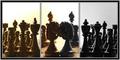
| 11/16/2005 09:17:48 PM | The Weddingby NekoNitaComment: I wonder if a suitable line from Rome and Juliet mightn't have encapsulated the idea of love amidst strife more neatly than your title? There is a sense of opposition in your composition, and I like that sense of balance you've achieved - and yet that title makes me think you've missed that potential entirely. |  Photographer found comment helpful. Photographer found comment helpful. |
| 11/16/2005 09:11:00 PM | WINTER WONDERLAND (Nature's artwork in ice)by BrinComment: Somehow it bothers me that you've simply used a reversed version of the first frame in the last. Is that really nature's artwork? That niggle aside, I love the sense of toning and the overall composition, and the impressionist-landscape feel to this. Clever stuff - but just a touch too manipulated for my taste. | | Photographer found comment helpful. |
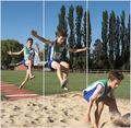
| 11/16/2005 09:07:37 PM | Breakthroughby owenComment: Decent photography - though I think things could be generally less bright - I wouldn't say this is over-exposed, but it would benefit from less brightness overall - increase the intensity of colours. Really unconvinced by the tricksy framing - the submission becomes more about the editing tricks than the effort of the athlete, I'm afraid. | | Photographer found comment helpful. |
| 11/16/2005 09:04:36 PM | Going Outby mandyturnerComment: Whilst I like the documentary sense to this series, I do feel htat a touch more care could have been taken with the final image - it looks so like the side of a man's face, rather than the same girl. Also the junction of the second and third images is a bit tricky - one's first glance is drawn to what seems a form of cubism, rather than simple illustration - which I guess is actually the point. | | Photographer found comment helpful. |
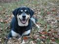
| 11/15/2005 06:54:46 PM | "Money will buy a pretty good dog, but it won't buy the wag of his tail." -Josh Billingsby HVGB_photosComment: from the darkened room of the Critique Club
Whoa, you got hammered on this one, no? I'm guessing you know the problem, certainly as far as the challenge topic was concerned - the invisibility of that wagging tail. I've really no idea how to siuggest an approach that would fix that - this isn't my field at all, clever things with shutter speeds, and all I can say is that you'd surely ideally need a very bright object, or at least brighter than it's surroundings, to leave a trail. Sam's tail appears largely black, and so that's just going to be invisible against any kind of light.
One element I think might repay some attention is that of saturation in your shot. Now - I think you've caught a certain kind of autumnal fading of light very well, especially whilst maintaining such detail in the dog's face, and there is also that suggesting of the bluness of the disappearing afternoon light which I find very atmospheric. From the file size and general sharpness, I have no doubts you're completely in control of what you're doing; but I'd bet you'd get a little more reaction from the general voter with more colour punch to your shots (or even perhaps less - black and white?) but with more contrast. Had you been able to show more richness in those greens and browns of the grass and leaves, I bet you'd have got a few more views - whether that would have attracted higher votes is another matter. | | Photographer found comment helpful. |
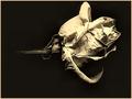
| 11/08/2005 07:38:20 PM | Delicate Petalsby gurlwithapenComment: from the terra incognita of the Critique Club ...
This has very many of the necessary qualities of a very fine study in my eyes - not unlike the work of adine, whose stuff I've long admired. what I mean there is the strong sense of texture, and of light, the depth of tone that only really can be found in black and white, and the sense of understanding that actually all still lifes approach the quality of landscape photography, in the end.
There is one enormous hurdle that the image simply could not overcome - which is that of quality. It's about 35Kb as submitted, whihc means you've left 115Kb of possible information unused. whether it's your software, your camera, whatever - folks will hammer you in voting for that kind of thing, and it's certainly what's happened here. Many many far less interesting shots fared much better in the challenge simply because the sheer presentational quality of them is better than this. The compression of he image has removed all of the very fine detail of texture that wins hearts in this kind of still life. I promsise you, a little time learning about re-sizing a compressing images for here will pay off big time, especially for a photographer with this kind of vision and understanding.
I would criticise one thing that can be seen here, which is your framing of your subject, particularly to the top of image, and particularly with your chosen border. The viewer's eye will readily wander out of frame given the chance, and taking the subject so close to the edge, particularly when not paralleled at the bottom of frame, gives more than enough opportunity. It's the reason many of the great photographic printers deliberately burned-in the corners of their prints, to give the stronger impression that the brighter and more interesting stuff tended away from the edges, rather than towards them.
Ed | | Photographer found comment helpful. |
| 11/08/2005 07:12:24 PM | Delicate Natureby JudiComment: from one of the less-frequented by-ways of the Critique Club ...
Given the finesse and rather strong approach to composition of your portrait work, I'm rather surprised to find that this is yours. Certainly you have a noticeable preference for a centred subject, but also you have a propensity to allow your subjects far more breathing space than this. It has the distinct feeling of an uncropped photograph - the aspect ratio, the tangle of twigs in the bottom right corner - though of course without your notes it's impossible to be certain.
I don't find a hell of a lot to critique about it, in many ways. There are areas where I might suggest a different approach: I think I'd have reduced the exposure a little, to prevent that blowing-out of highlights along the breasline; my instinct would certainly be to frame differently - almost definitely a portrait, rather than landscape; I might also have considered, for this challenge, including rather more landscape - using that to place the bird in relation to its world, as opposed to what becomes a simple depiction of the thing as presented here. Bt those are simply personal prefernes and thoughts, and really refer to an imaginary other photograph than this.
I can understand your using it for this challenge - but I think for many, myself included, this will have stretched the boundaries of the meaning of delicate too far. Whilst they certainly always seem liable to be easily broken - those legs! - and whilst the formation of the feathers on the wings is certainly minutely precise (and pretty well suggested here), one look at that beak and those eyes (and forget not that the eyes are the first and most natural point of a viewer's interest in all portraits) and any suggestion of delicacy flies out the window. He seems a hunter, pure and simple; little more than a mobile spear. That, I think (and I'd say the results bear me out) will certainly have lost you a few votes.
But I think it's the composition that really puts it into 'around average' territory. This is my reaction on first seeing the shot: the eye of course is drawn immediately to the head and eyes of the bird - this is human-default mode, and unavoidable; The brightness of the body then pulls the eye down, until the sense of action in bottom-right of frame pulls the eye there - however, given the depth of field, the confision of those twigs, htere isn't much to hold interest there - and the next strongest shape in your image, the slight curve of the shoreline, draws the eye up and left, hunting for some resolution amonst those boulders and splashes, and not really finding anything. Lines other than the vertical and horizontal draw the interest more quickly than others - however suggested rather than precise they are, and I think in photographs of the natural world sometimes your only key to a graphical sense of composition can be in suggested and hinted-at lines. And having mentioned horizontal lines - well, what's that, immediately below your subjects head, almost literally marginalising what ought to be the very centre of attention?
I think more than anything those factors combine to give a sense of the uncomfortable to this image, without there being anything blatantly 'wrong' with it. And yet you seem to have a natural way with such lines in your portraiture ... very strange.
Good luck in future; I must find time to see more of your work.
Ed | | Photographer found comment helpful. |
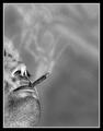
| 11/07/2005 07:47:48 PM | Dead Endby jjbeguinComment: Oh - I was getting fed up with too many nonsense shots in this challenge, but this I like. It has a 60's filmic quality that is very well done, and a sense of the (extra)ordinary that sits very well with me. The sparrows add a near-surreal touch. what, by orthodix thinking, ought to be very poor light, wrks well to flatten and geometricise the scene, and there's a certain balance to the compositional weight that pleases me. Nice work | | Photographer found comment helpful. |
| 11/07/2005 07:45:25 PM | Slow, but certain dead endby samanwarComment: Yep - to live is to die. I find the processing enormously overdone here. Composition is fine, in a kind of stock manner, and the smoke is well brought out. | | Photographer found comment helpful. |
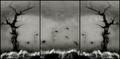
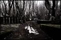
| 11/07/2005 07:31:51 PM | Dead End?by garlicComment: In the same way I fail to understand people who think The Exorcist is the greatest film ever made, I fail to understand the near-obsession around here lately with this kind of mock-gothic type of stuff. I find it hard to believe that this has anything to do with the world in which any of us lives, and fail not least on those grounds to find anything very interesting in it. There is abundant and evident skill in this work - technical savvy, fine execution, mood, detail, off-beat but happy composition. but I wish that could be brought to a more grown-up ambition that these neo-baroque fantasies. I'm sorry, but it angers me to see such ability harnessed to such work. | | Photographer found comment helpful. |
|
Showing 941 - 950 of ~2866 |
Home -
Challenges -
Community -
League -
Photos -
Cameras -
Lenses -
Learn -
Help -
Terms of Use -
Privacy -
Top ^
DPChallenge, and website content and design, Copyright © 2001-2025 Challenging Technologies, LLC.
All digital photo copyrights belong to the photographers and may not be used without permission.
Current Server Time: 08/20/2025 10:50:29 PM EDT.
|