from the terra incognita of the Critique Club ...
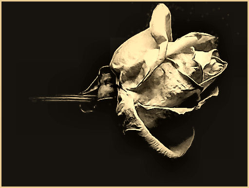
This has very many of the necessary qualities of a very fine study in my eyes - not unlike the work of adine, whose stuff I've long admired. what I mean there is the strong sense of texture, and of light, the depth of tone that only really can be found in black and white, and the sense of understanding that actually all still lifes approach the quality of landscape photography, in the end.
There is one enormous hurdle that the image simply could not overcome - which is that of quality. It's about 35Kb as submitted, whihc means you've left 115Kb of possible information unused. whether it's your software, your camera, whatever - folks will hammer you in voting for that kind of thing, and it's certainly what's happened here. Many many far less interesting shots fared much better in the challenge simply because the sheer presentational quality of them is better than this. The compression of he image has removed all of the very fine detail of texture that wins hearts in this kind of still life. I promsise you, a little time learning about re-sizing a compressing images for here will pay off big time, especially for a photographer with this kind of vision and understanding.
I would criticise one thing that can be seen here, which is your framing of your subject, particularly to the top of image, and particularly with your chosen border. The viewer's eye will readily wander out of frame given the chance, and taking the subject so close to the edge, particularly when not paralleled at the bottom of frame, gives more than enough opportunity. It's the reason many of the great photographic printers deliberately burned-in the corners of their prints, to give the stronger impression that the brighter and more interesting stuff tended away from the edges, rather than towards them.
Ed |