|
|
|
Showing 891 - 900 of ~2866 |
| Image |
Comment |
| 02/23/2006 01:08:38 PM | I love you, you're perfect, no changeby litsaComment: I find this very poor. Nothing has been done to control the range of exposure, all the tones are compressed into a very narrow range indeed, with the result that it feels hopelessly amateur. The sepia toning is also very heavy, and hasn't helped. I'd have a damn good go at it with the levels tool, at the very least. However, I suspect that the composition of the shot isn't interesting enough for even that to put it into contention. |  Photographer found comment helpful. Photographer found comment helpful. |
| 02/23/2006 01:06:08 PM | The Drying Shedby gsalComment: Has a certain old-fashioned feel to it - probably because of the narrow dynamic range here: you're a long way from white, and I think that's not done any favours for the overall tonality of your image. There is good detail, but the scene doesn't hold enough magic for me. | | Photographer found comment helpful. |
| 02/08/2006 05:36:53 AM | speedoby SkipComment: Seriously, you should get them to put this up for the World Press Photo - not least because they seem to love swimming shots in that competition. This is marvellous my friend, and by far the most striking image in the study. And, oh, the worst of all possible placings, to quote JJ. | | Photographer found comment helpful. |
| 01/24/2006 04:42:04 PM | Eye Contact by jjbeguinComment: You continue to find images that susprise and delight - your imaginative facility always prompts the thought 'what if we were to run out of available images?' very glad to see you hitting the heights here again. | | Photographer found comment helpful. |
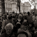
| 01/19/2006 11:14:15 AM | New York Times by JPRComment: I meant to congratulate you on your double hit on the front page - but most especially on this shot, and more especially on ribboning with a meaningful and complex piece of street-work - but I've been away, and out of on-line-ness recently. You'll just have to settle for the biggest compliment the site allows. | | Photographer found comment helpful. |
| 12/21/2005 03:59:28 AM | | | Photographer found comment helpful. |
| 12/17/2005 07:31:32 PM | Spooningby swm4lfe_2001Comment: from the inside back page of the Critique Club
Now this, i think, might possibly have been an interesting image - but in dimensions its less than a quarter, and in data only about 3% or what's available to you here. I know it's been said over and over in comments, but it's so true it doesn't hurt to re-inforce it.
The technical stuff really is a problem. From what one can tell, it might well ahve been a fine image - a decent idea, and certainly well executed - the depth of field looks good, and the colour and tonality is great too. Compositionally, you might have benefitted a touch from using the stronger diagonal line more - the curves of the forks hint at that, but the handles go straight to the edge of frame, which is usually a weaker idea; also, had you had that line of the handles heading up into the top right of frame, more of the tines of the forks might be visible which would also strengthen the detail in the shot.
But it's the size thing that does for this - as I look, it's very hard to see the compression artefacts around the forks, so obviously any real detail is going to be equally difficult to see. | | Photographer found comment helpful. |
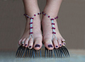
| 12/17/2005 06:59:58 AM | New Fashion Trend - Forkliftsby ColeyComment: from the cupboard under the stairs of the Critique Club
It interest me greatly here that the actual subject of the photograph, in an obviously controlled environment, becomes the central interest of people's ocmments and ratings. Obviously, that's inevitable in a challenge such as this one - but actually, is it about photography? I think not - it's more about some kind of suclpture, I think, about the creation of a record of an odd set-up, and the photography simply becomes a process of recording that avoiding some pitfalls of exposure and detail etc. To my view, anyone with reasonable experience, facilities, and practice should be able to do this.
So, your photograph is actually about your set-up, yes? And here, I think your notes say it all - 'an on-going study of feet': and it's the feet that so dominate the image that I think this has hurt your score. The forks are quite clearly essential, but then you scored pretty well, so not everyone thought that was an issue.
Now, having given you my opinion of this kind of stuff, I have to say that this is possibly the most interesting shot of its type in that challenge. I do agree with one point made about the 'feel' of the image. I think that's to do with the skin-tones of the feet themselves - they have a slight blue-ish cast that makes them look cold. A slight change of colour temperature, or perhaps simply a warmer light might have helped there.
I also think that some people find feet generally an unappealing subject, and that will have taken a vote or two away from you.
e | | Photographer found comment helpful. |
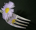
| 12/17/2005 06:43:50 AM | Mirrowed Flowerby AlanBesComment: from the back room of the Critique Club
I think the basic idea here is good - for the challenge, of course; it might have been better, in a purely compositional way, had you been able to get the reflection of that flower without having the actual flower in shot - but given the convexity of the spoon that's terribly difficult.
Two things I think promarily hurt this one: firstly the composition, your framing of the image: either you've allowed too much negative space image right, of simply haven't managed to get the angle on the spoon - the diagonal line is always a very strong compositional element (look at som many of the recent studio shot winners) - but this has drifted too far off that line to really work.
The second thing is the quality of the image itself. It doesn't have the clarity, the level of fine detail that winning shots here have. Now this certainly isn't down to your camera - we all know how precise the 350 can be - so i think it must be in your processing. I couldn't really say which part of the process has caused the problem - perhaps the 'clarifiying' step - these automatic actions are designed to work with Joe Punter's photographs of their holidays - ratherthan a naturally high-contrast image like this, and that may have pushed the tonality of the spoon into the funny slightly blobky feeling it has here. perhaps it's your re-sizing process, I don't know. It could also be your sharpening - looking along the nearer edge of the fork, there is that tell-tale line of white that looks generated rather than natural, and that could well be a sharpening thing. At the risk of teaching grandmothers etc., I'd suggest using setting something like radius:0.6, amount:100, clipping:5 for sharpening, and making it the last thing you do in your processing - the miss-use of it is so often a cause for detail problems in people's work, and I remember the impact on my own stuff when i realised you could set the radius below 1; but like I said, I don't know that that's actually the issue.
HTH
e | | Photographer found comment helpful. |
| 12/17/2005 06:28:27 AM | Who's gonna be the first?by M&MComment: from the circumference of the Critique Club
Just for fun then ...
I've never seen this kind of shot do well on dpc - there are a number of fundamental problems photographically that'll stop it, and one or two challenge-wise that hurt it more.
Primarily you have a major white-balance issue - surely the table cloth should be white, and what you have here is blue-green and rather dark: low light can make this difficult for the camera to sense, but it's easily fixable in processing, surely.
The disqualification was apt - I think you had to add those light-points because otherwise the cutlery was simply not prominent enough in your shot for most people to notice - never forget that the vast majority of voters look at your image for about a second - you need to hit them pretty hard and pretty quickly.
The light is pretty harsh and dull - the cake has become a dark muddy nothingness, and the santas are the only true subject of this shot.
All that and exactly the kind of border that does more to draw attention to itself than anything in the photograph. I'd be absolutely certain that it wasn't scoring so well before the DQ: those things mentioned are the real problem, and they are major problems.
e | | Photographer found comment helpful. |
|
Showing 891 - 900 of ~2866 |
Home -
Challenges -
Community -
League -
Photos -
Cameras -
Lenses -
Learn -
Help -
Terms of Use -
Privacy -
Top ^
DPChallenge, and website content and design, Copyright © 2001-2025 Challenging Technologies, LLC.
All digital photo copyrights belong to the photographers and may not be used without permission.
Current Server Time: 08/20/2025 07:07:18 PM EDT.
|